For this project, I explored the theme of mosquito-borne diseases, telling the story entirely from the perspective of the mosquitoes themselves. The concept frames mosquitoes as a highly organized enterprise offering disease delivery services, with humans and animals as the targets and viruses as the clients. Initially, I was fully immersed in developing this fictional company, but in doing so, I lost sight of the fact that my real audience is still human. As a result, my early iterations felt disconnected and lacked clarity. I resolved this by integrating references to actual mosquito species and reworking the language to keep the concept grounded, even within its satirical framework.
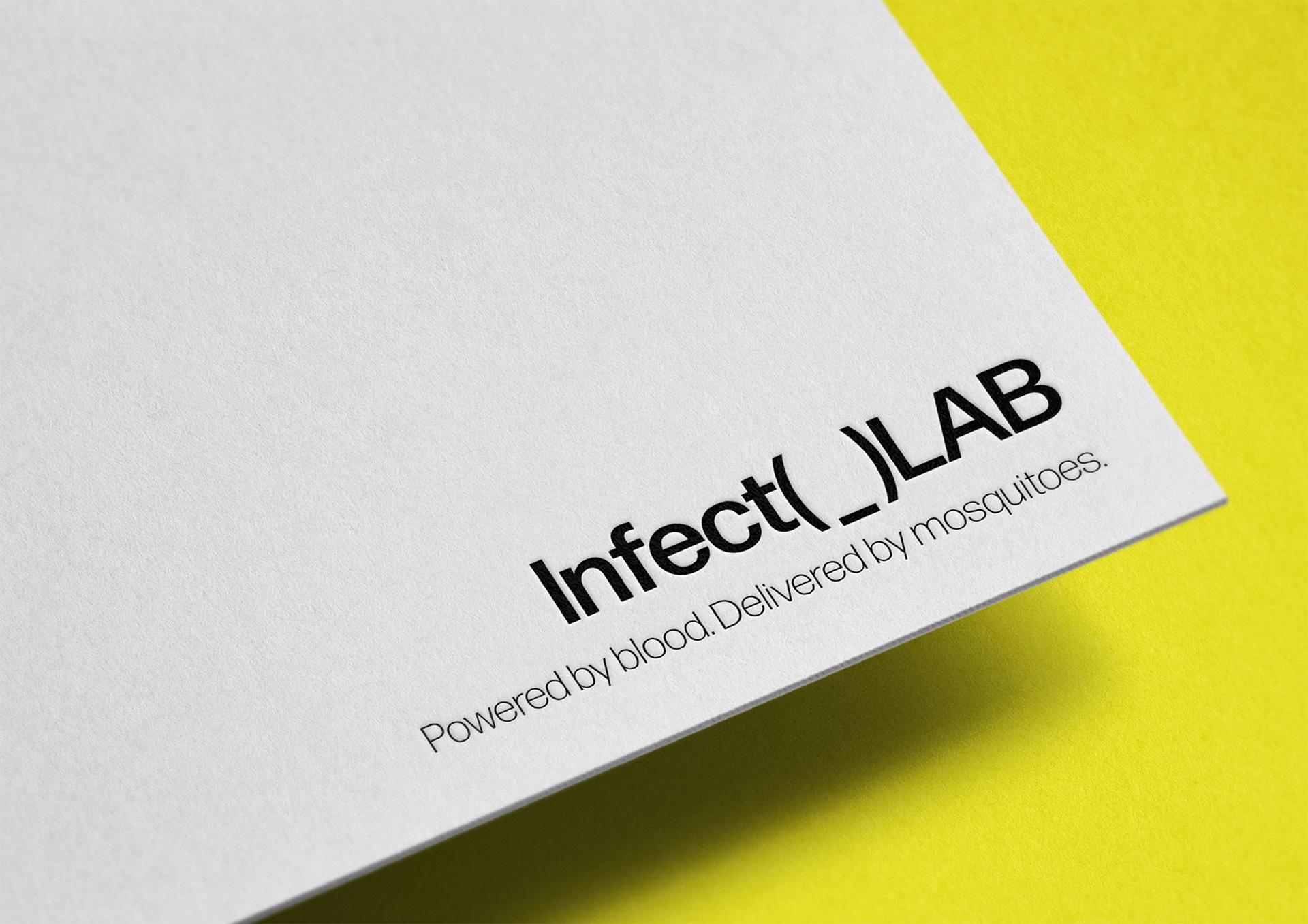
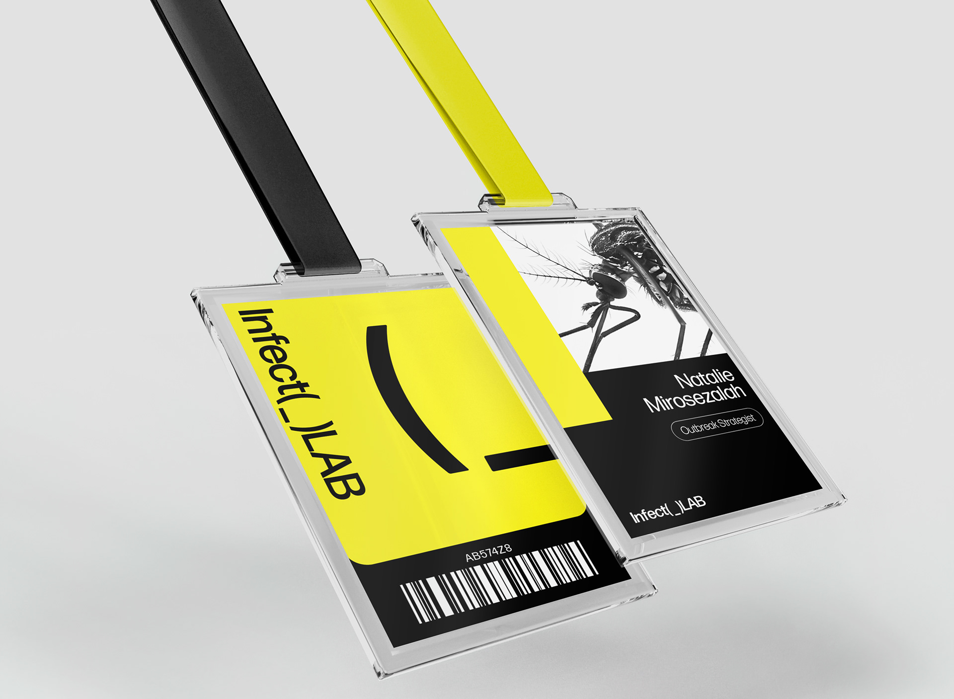
I pivoted toward a visual system that prioritized shape and line, creating a clean, confident look more suited to the biotech brand personality. Yellow became my dominant color due to its association with danger, high visibility, and its sharp contrast with black and white. I used a single typeface throughout the project, Forma DJR Deck, for its versatility and clean geometry.
For the logo, I explored both expressive and minimalist options. The expressive, icon-driven versions felt too human in their design language, which conflicted with the idea of a mosquito-led brand. I ultimately chose a stripped-down wordmark that felt more neutral and anonymous, helping further separate the voice of the brand from my own identity as the human designer.
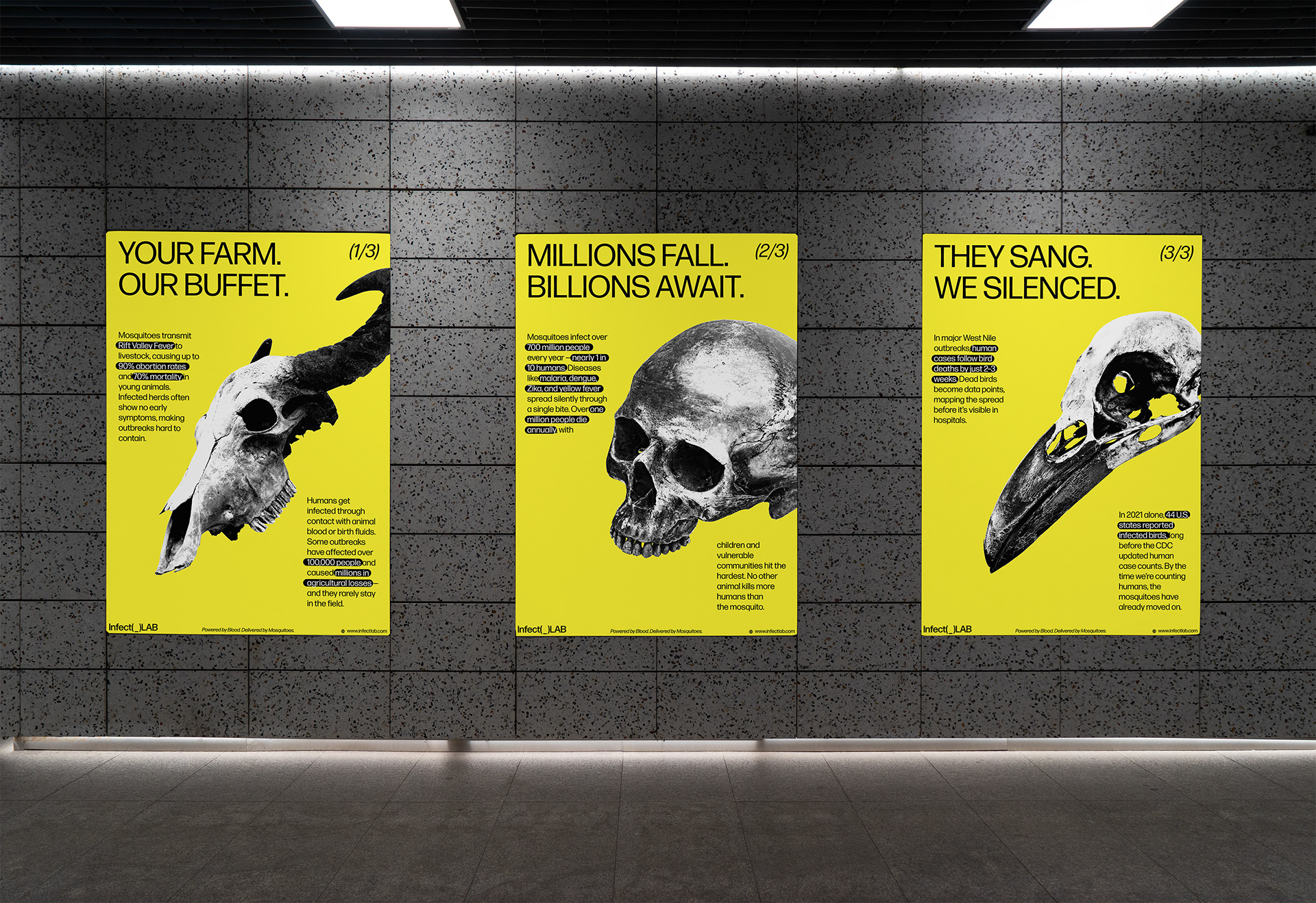
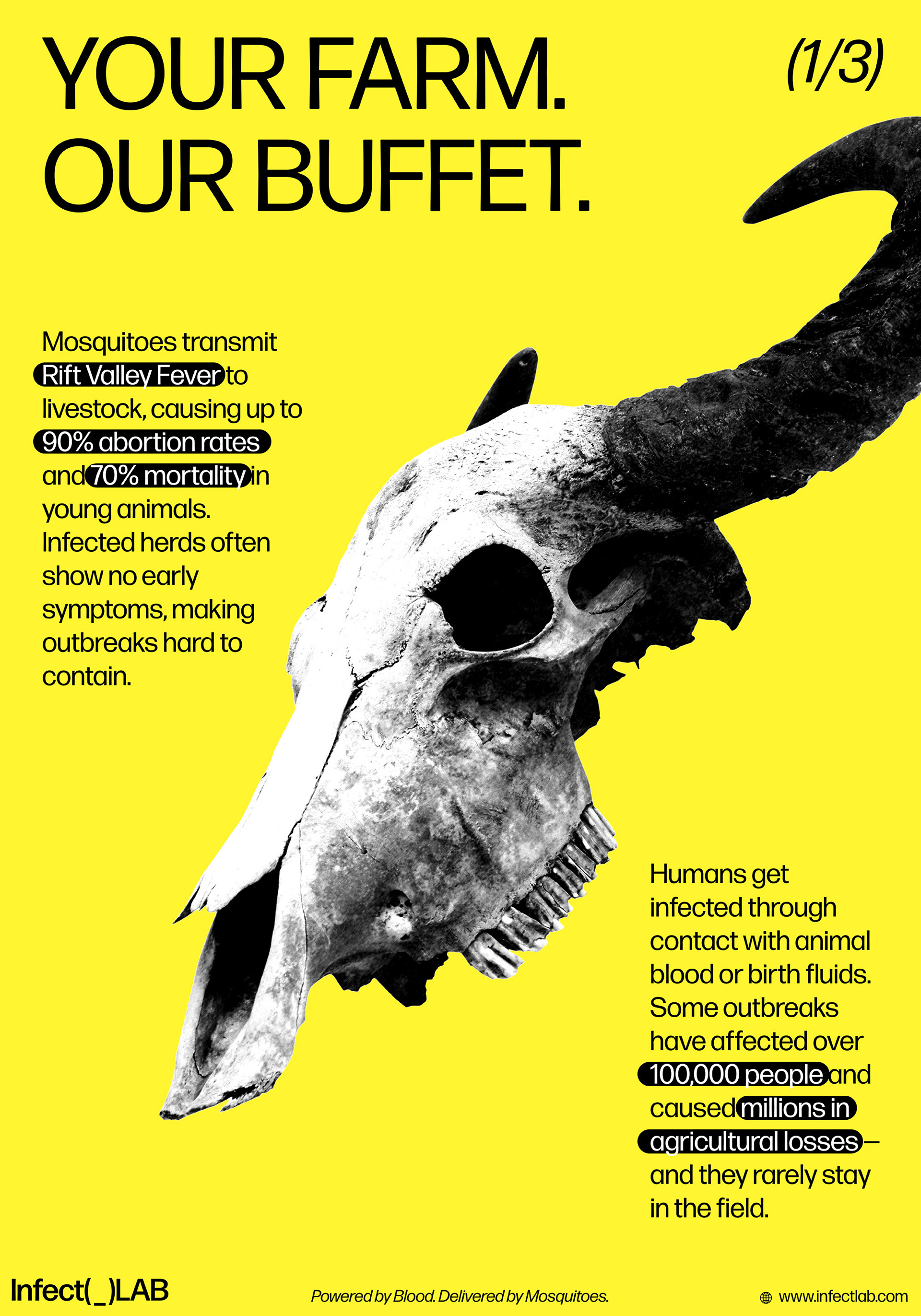
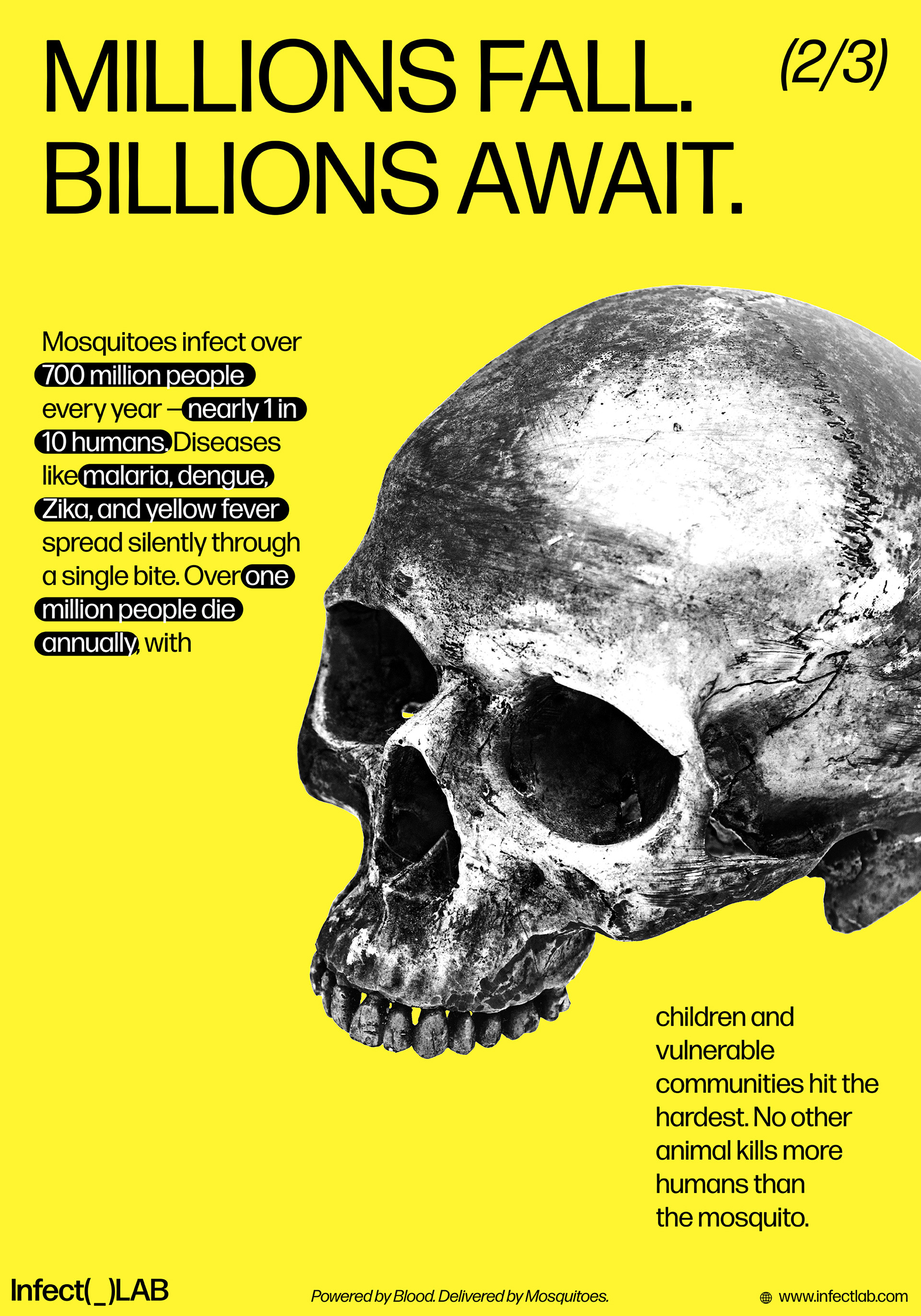
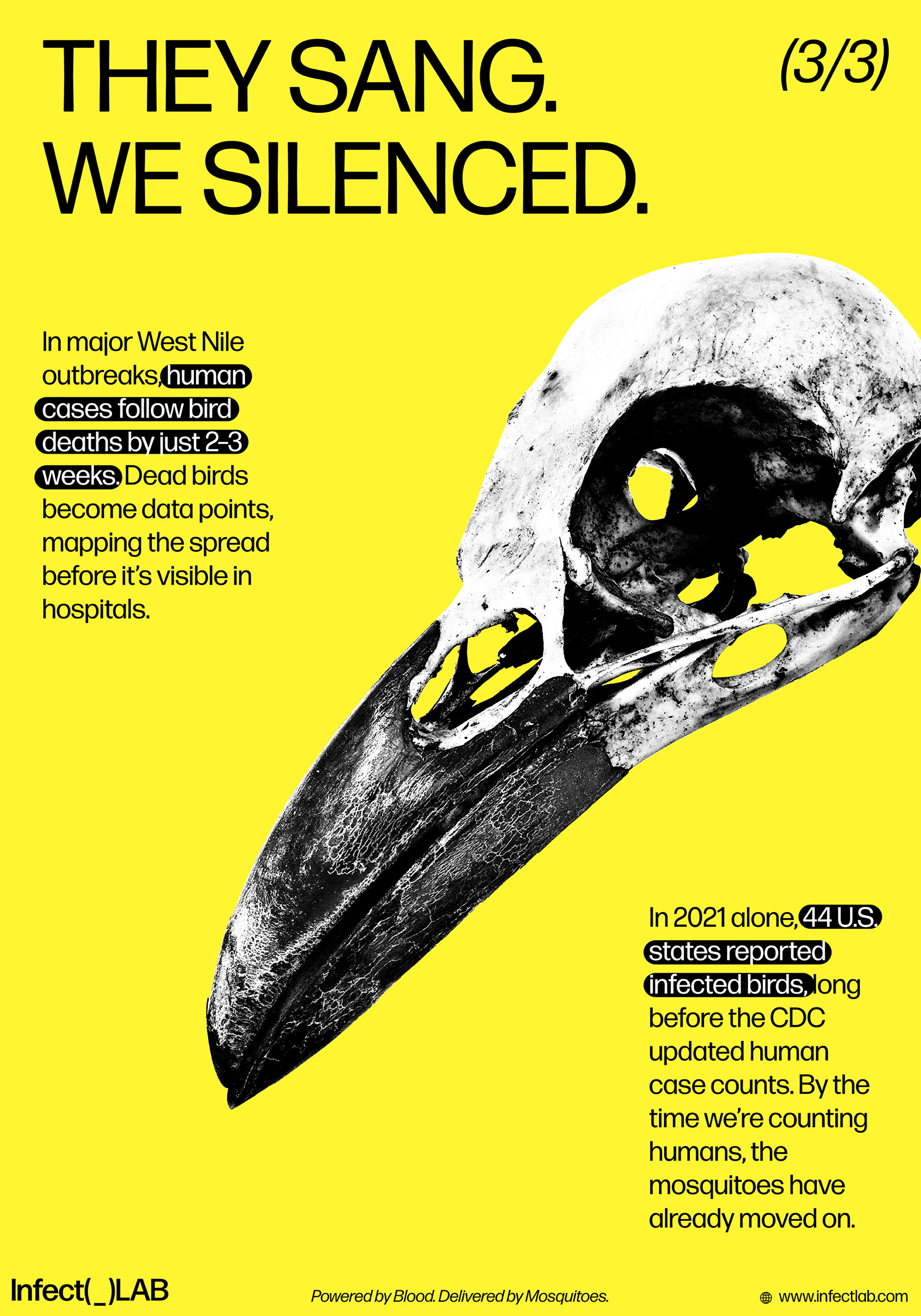
My poster series featured skulls of a buffalo, a human, and a crow, aka three of the most impacted victims of mosquito-borne diseases. Each poster includes the logo, tagline, a four-word headline, website, and three to four lines of factual data. I designed them as proud, satirical “milestone” announcements for the company.
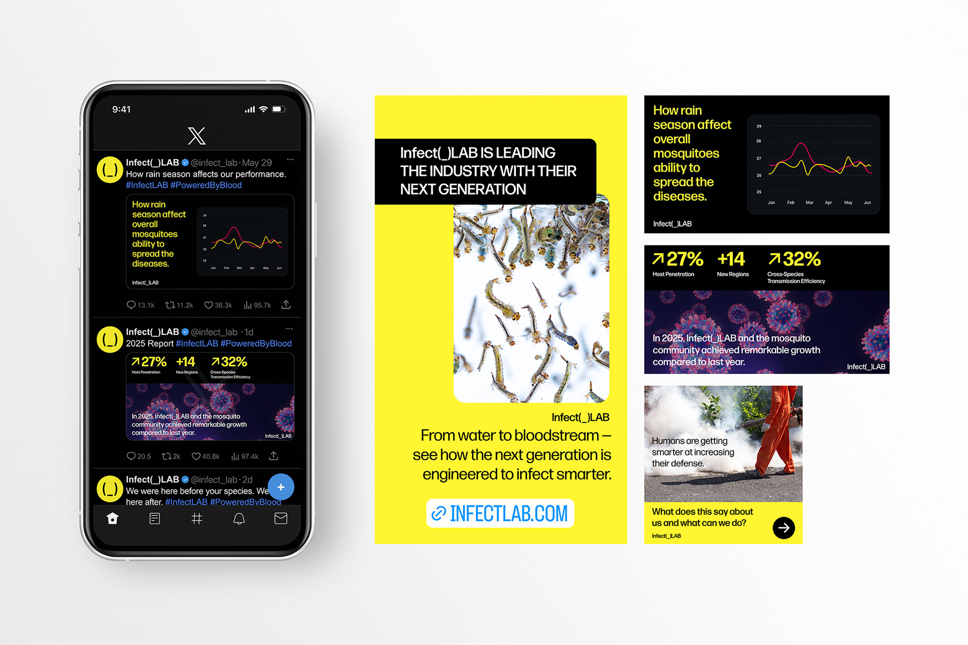
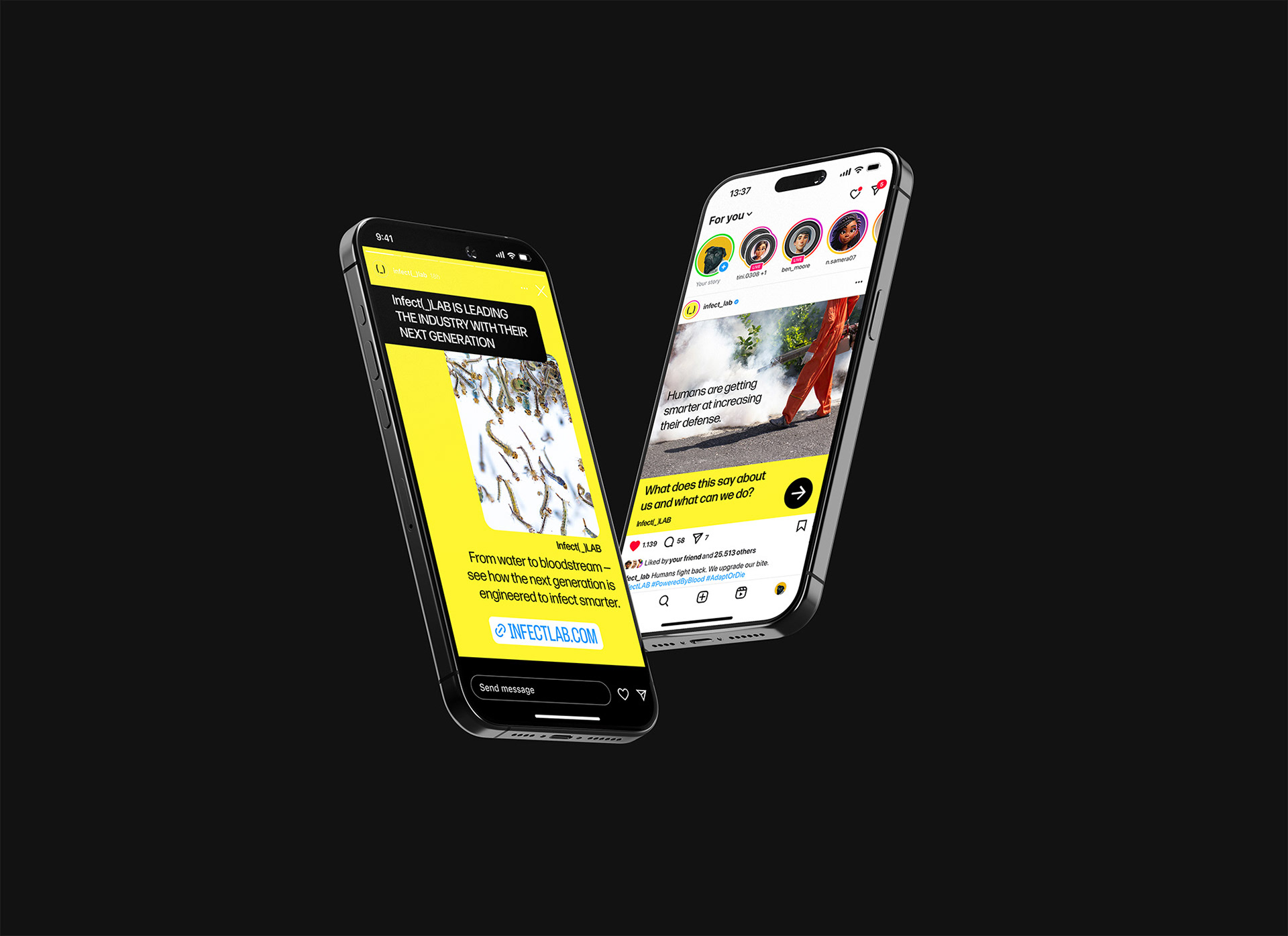
For social media, I created a cohesive campaign across Instagram Stories, posts, and X, all maintaining the same minimal, structured tone and aesthetic.
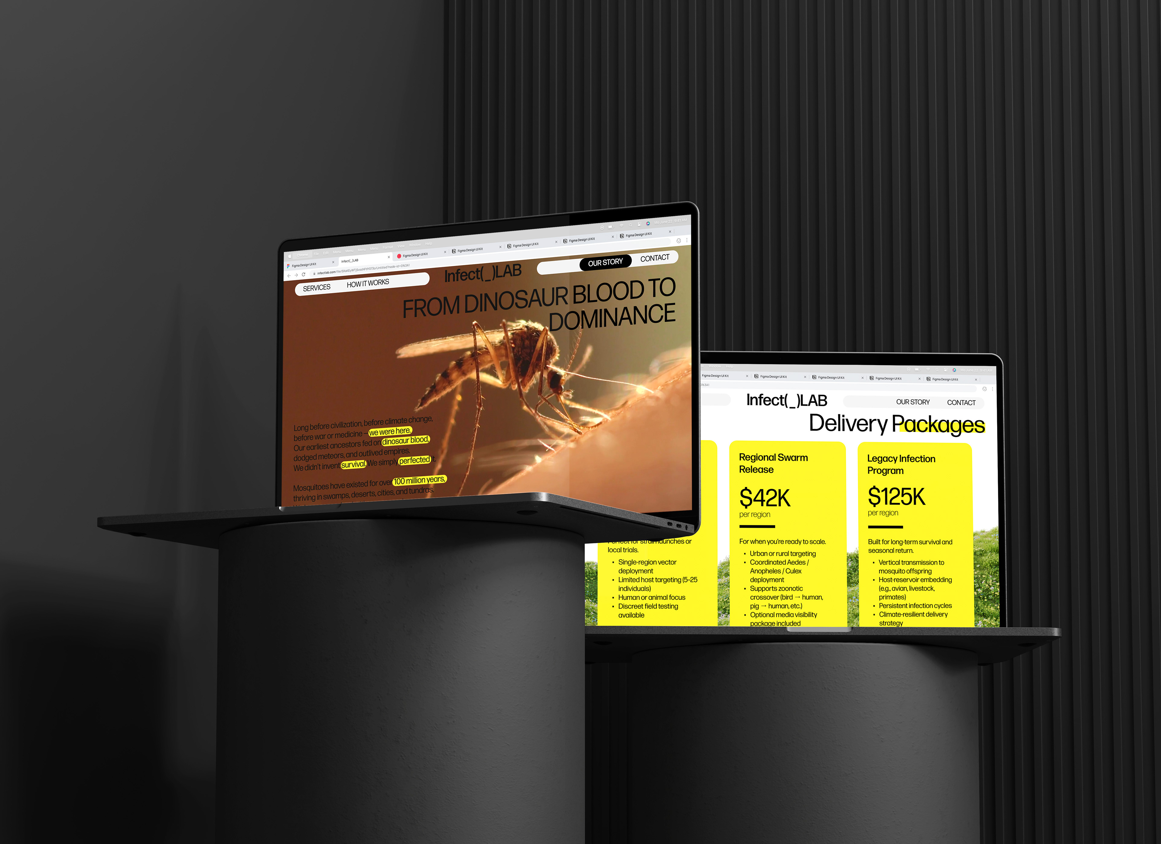
The website consists of four pages: Home (tagline, reviews, core values), Services (delivery plans and add-ons), How It Works (infection methods), and Our Story (mosquito life cycle). A key challenge was establishing a hierarchy while using only one typeface, with no italics and limited weight. I solved this using unfinished highlights, strokes, and negative space, which are elements that also carried over to my posters.