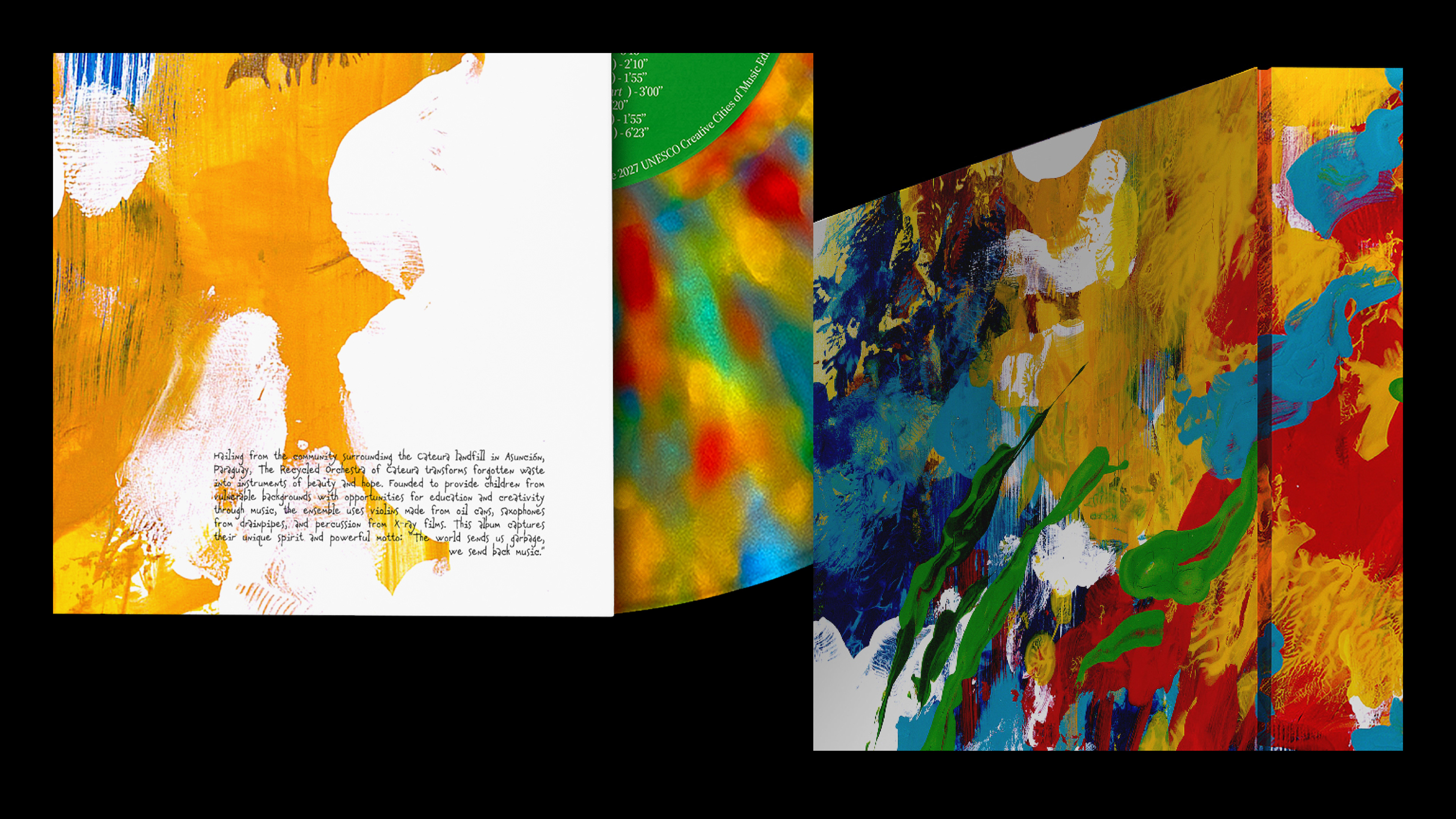
The Recycled Orchestra of Cateura is a world-renowned youth ensemble from Paraguay that plays music using instruments constructed entirely from landfill trash. Founded in a slum built around a garbage dump, the project transforms recycled waste, like tin cans into violins and oil drums into cellos, to provide free music education and a safe haven for vulnerable children. Their inspiring story has captivated global audiences, including myself, leading to international tours, an acclaimed documentary, and performances alongside major rock bands.
After watching their documentaries, I couldn't help but feel deeply connected and responsible for creating the branding that truly speaks their voice.
2026 STA 100 Winner – Society of Typographic Arts
2026 ADAI's 68th Exhibition — Award of Excellence in Integrated Brand System, Identity Mark, Poster Design, and Design for Social Impact/ Public Service
2026 ADAI's 68th Exhibition — Board's Choice
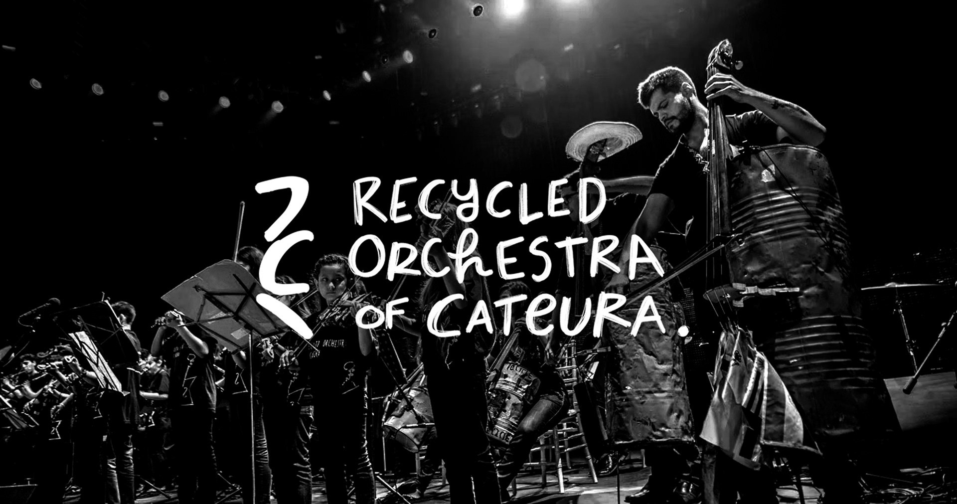
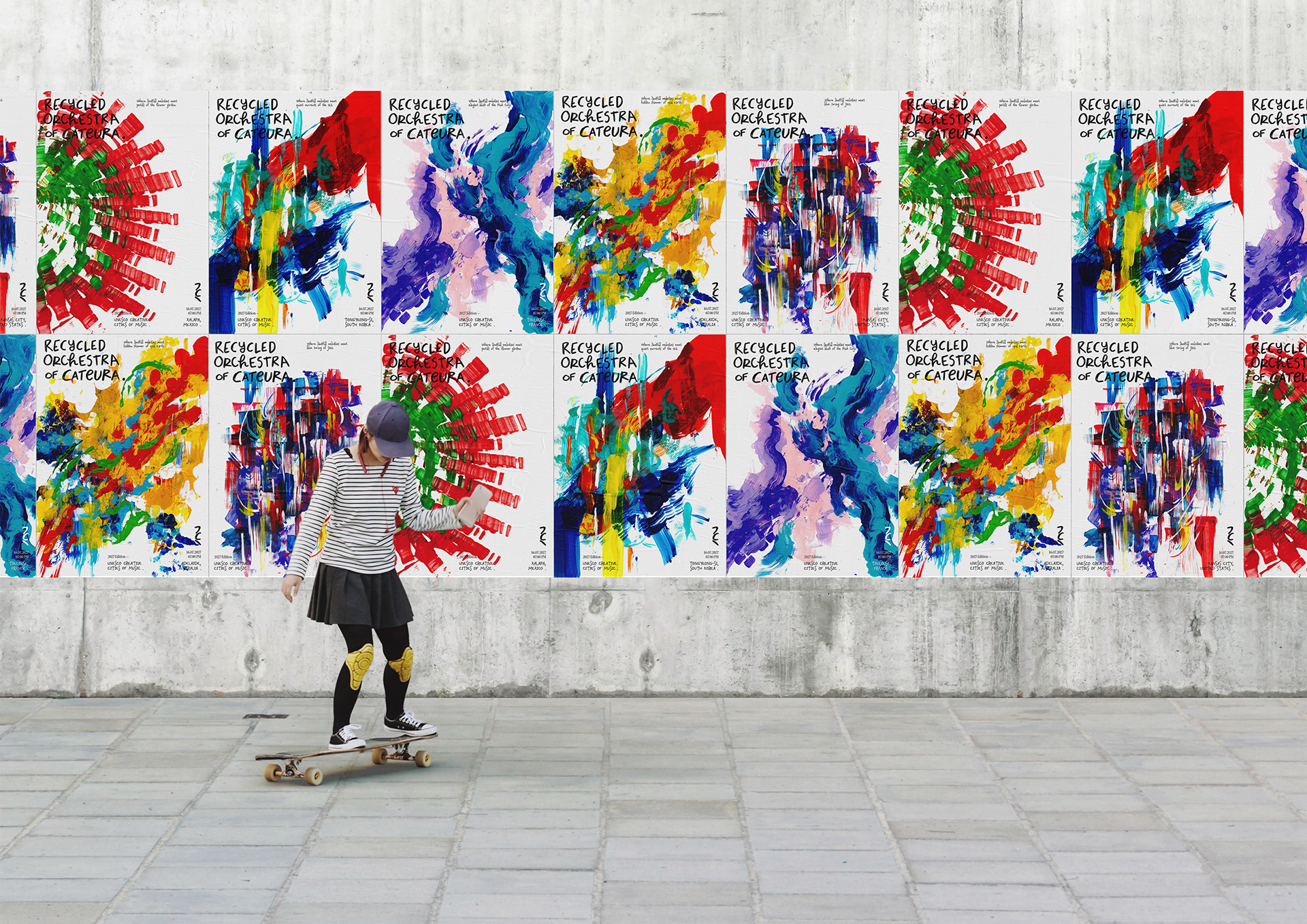
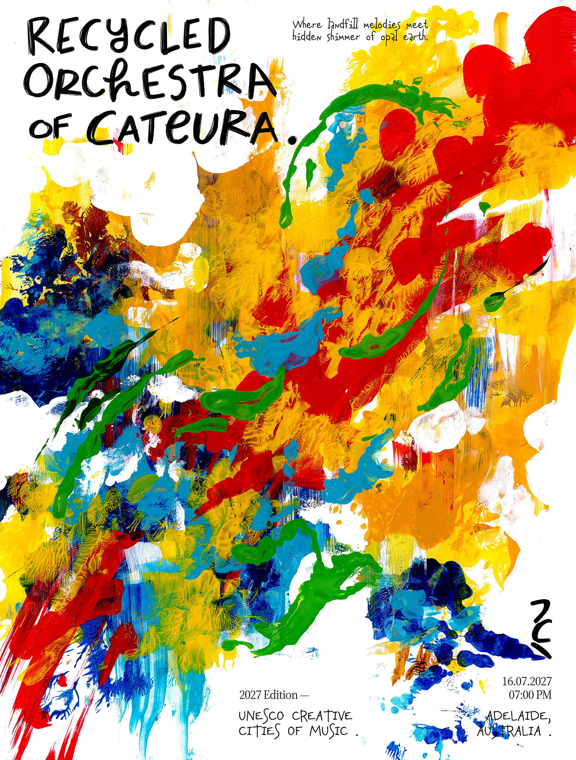
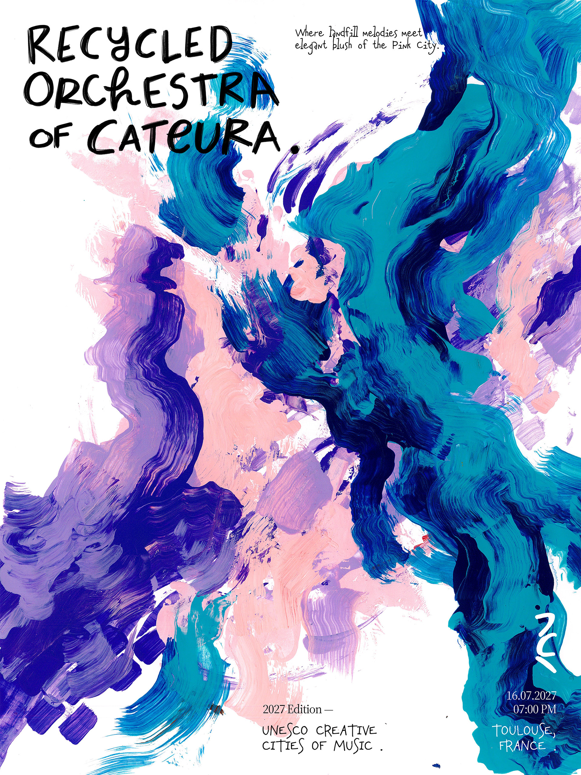
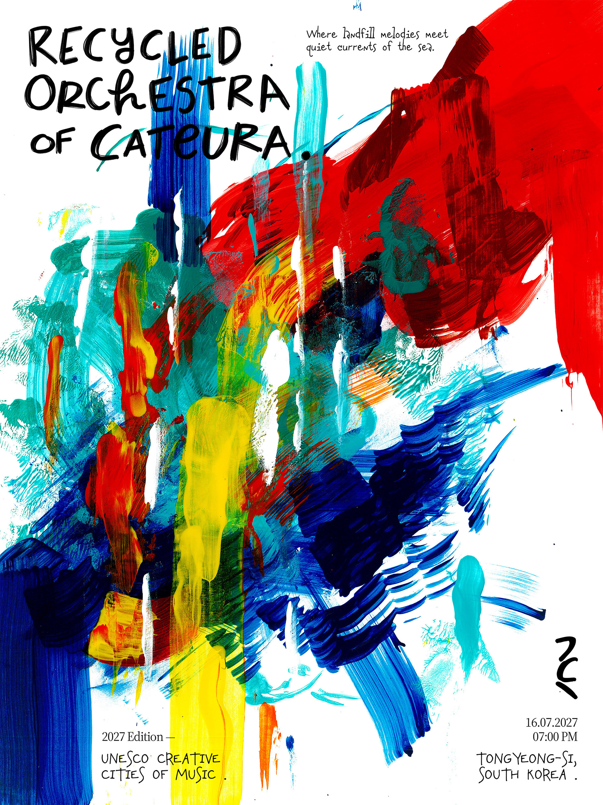
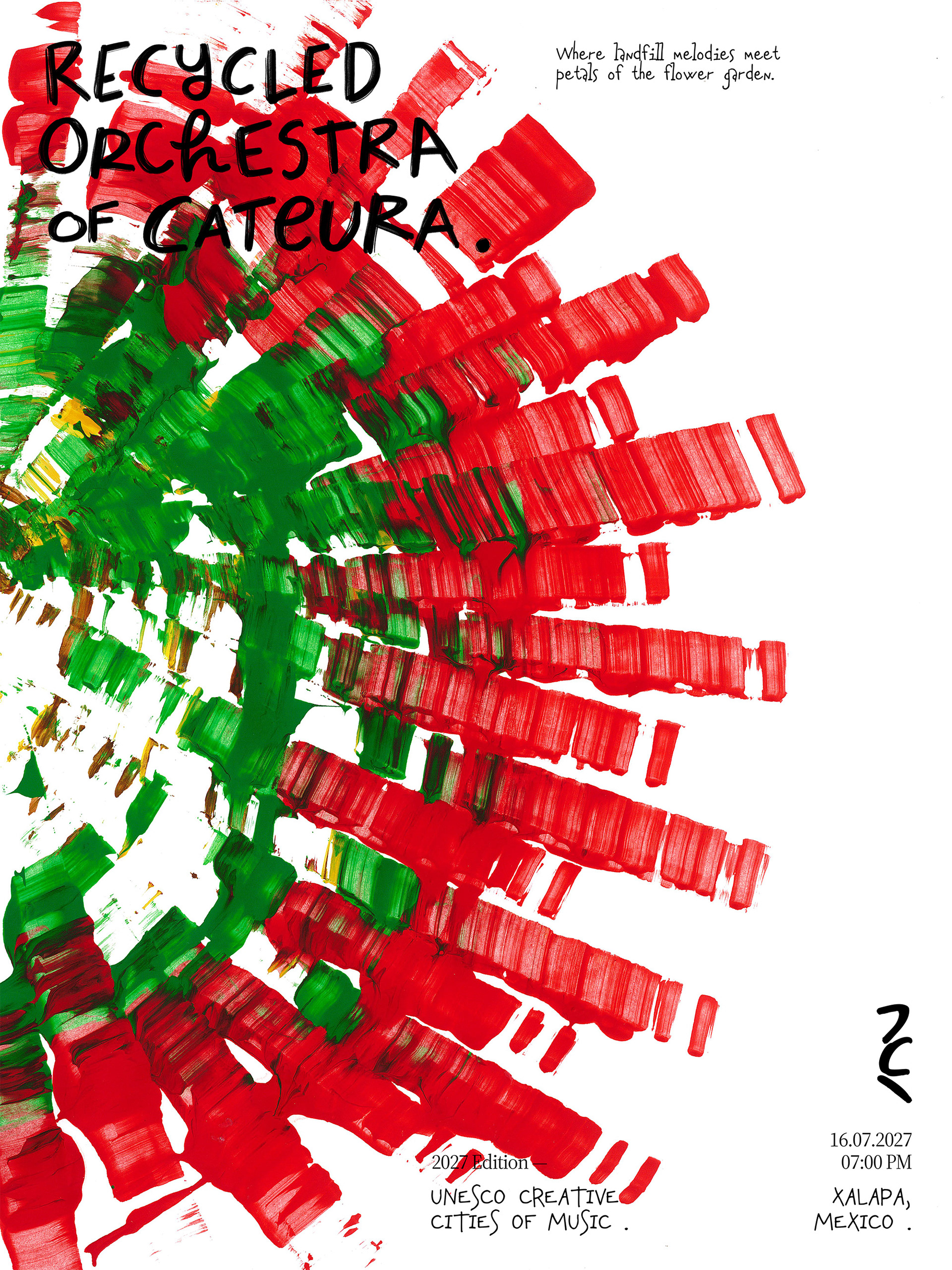
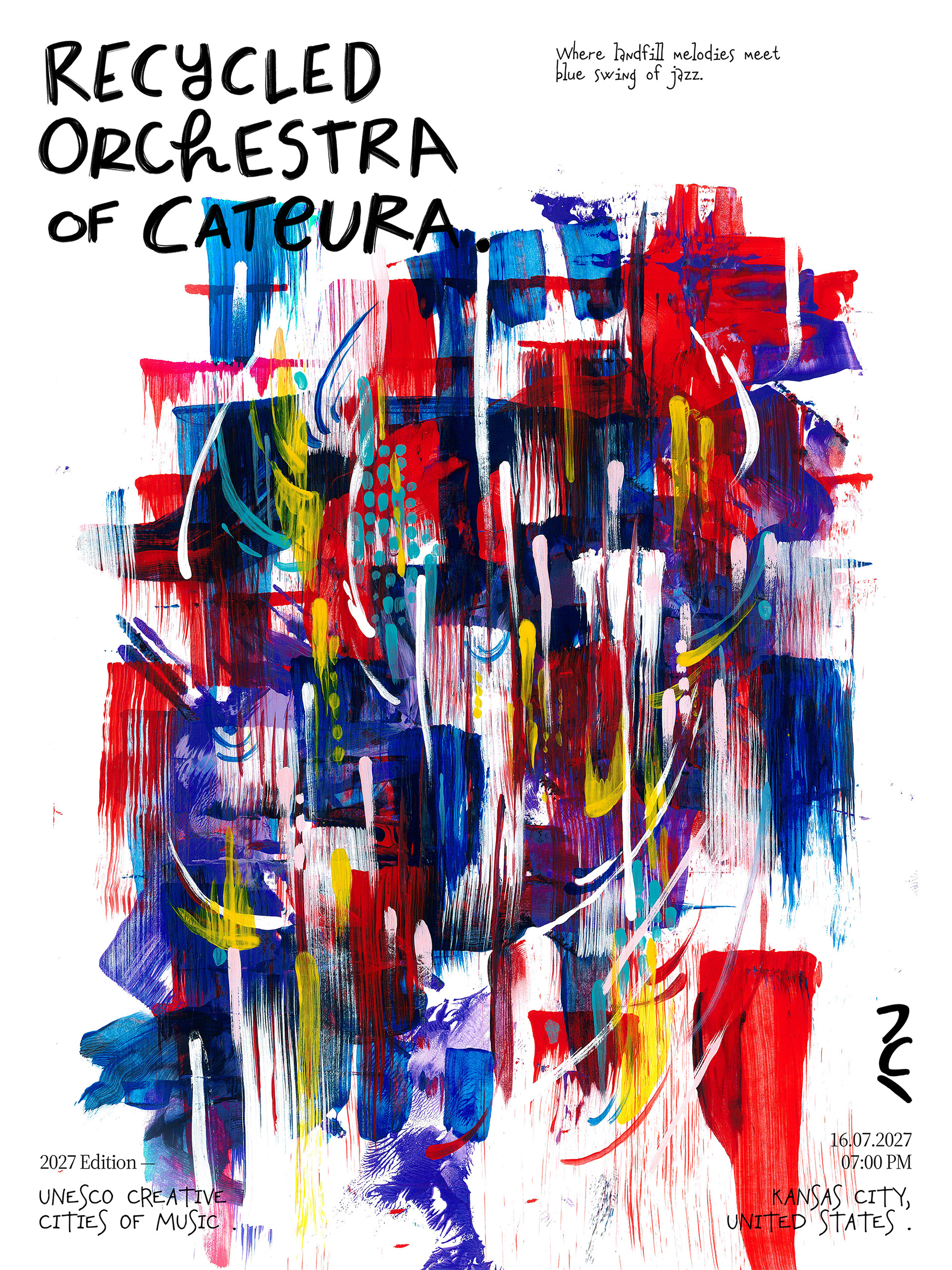
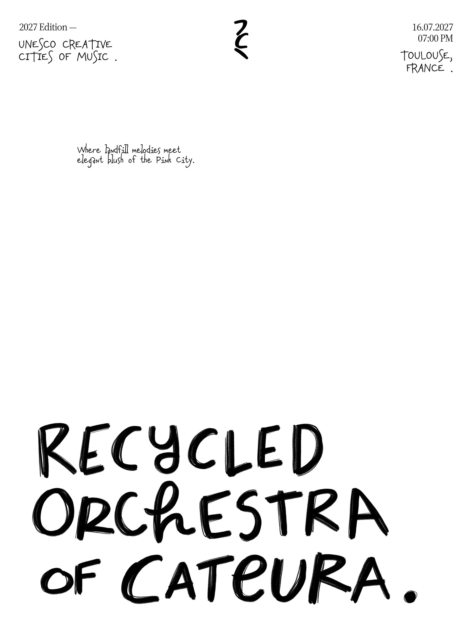
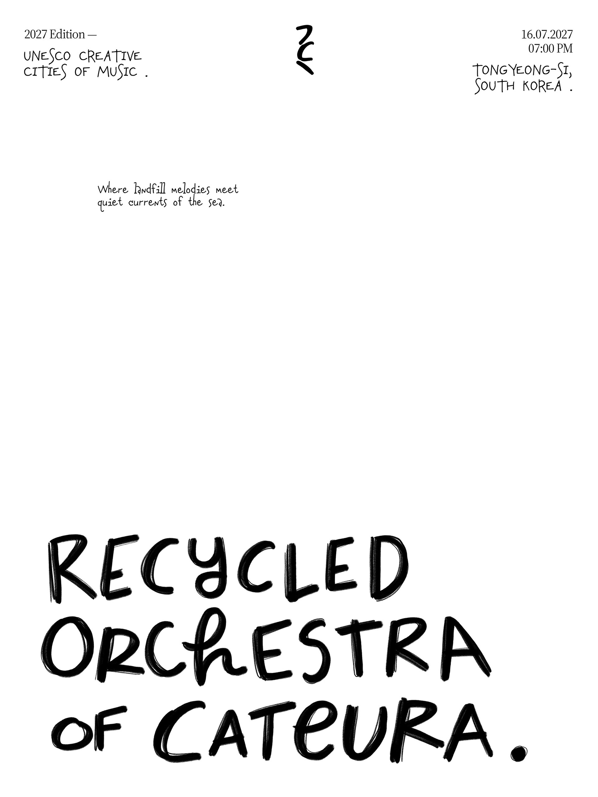
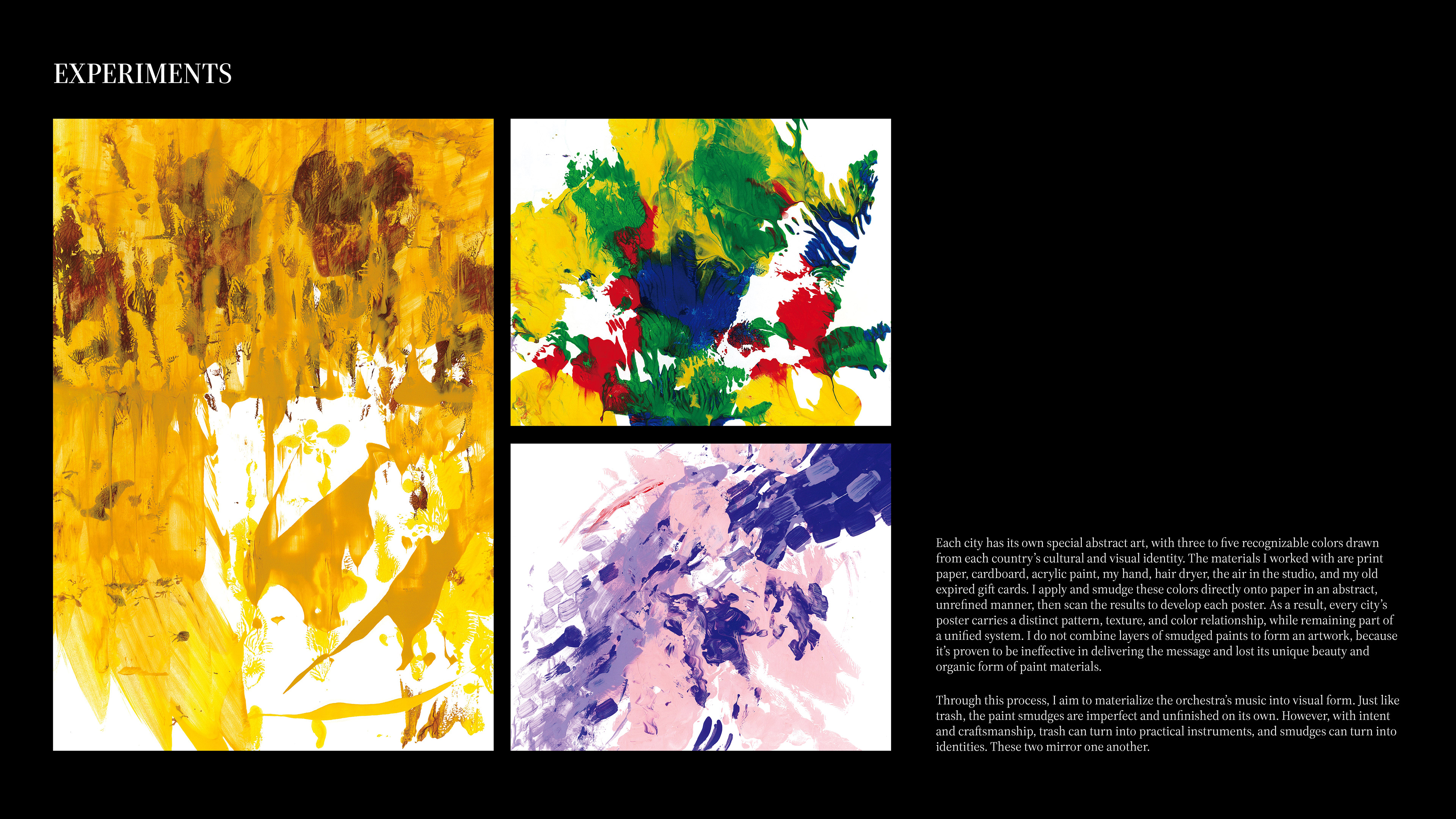
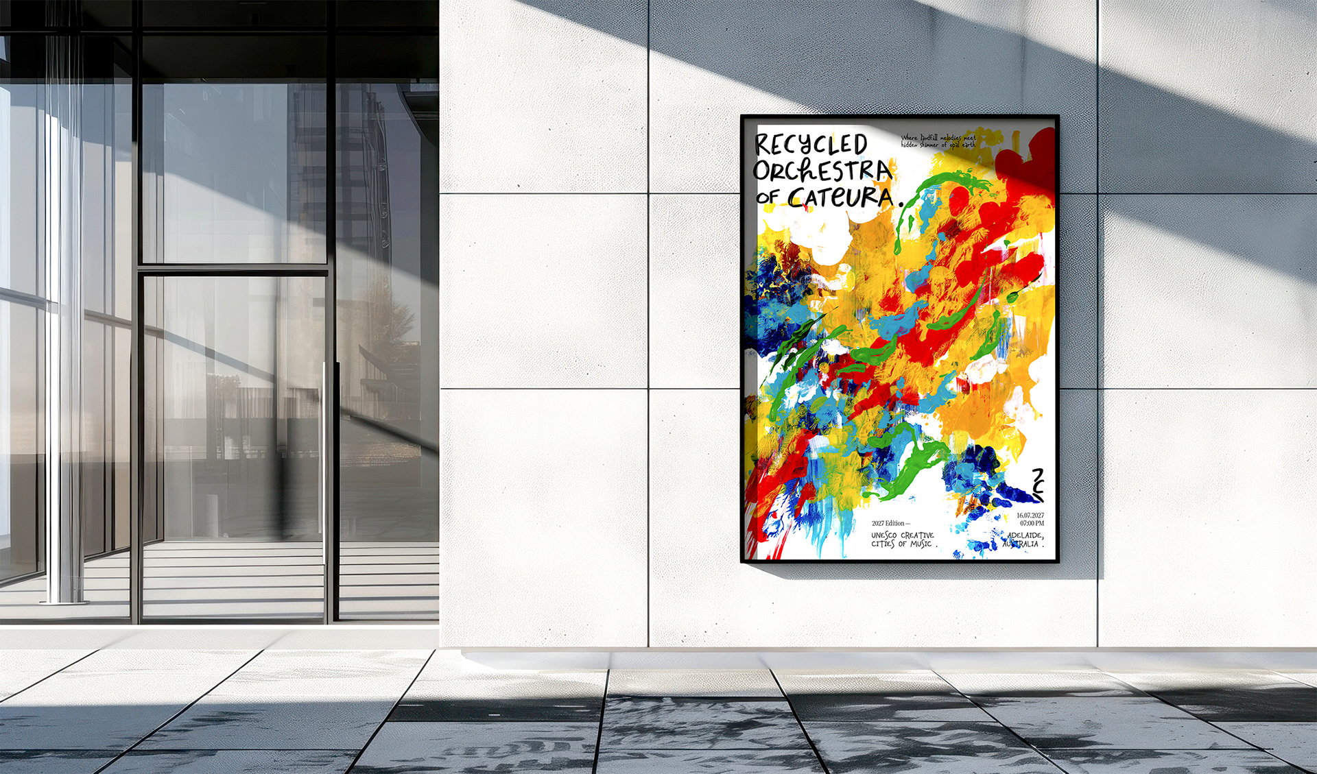
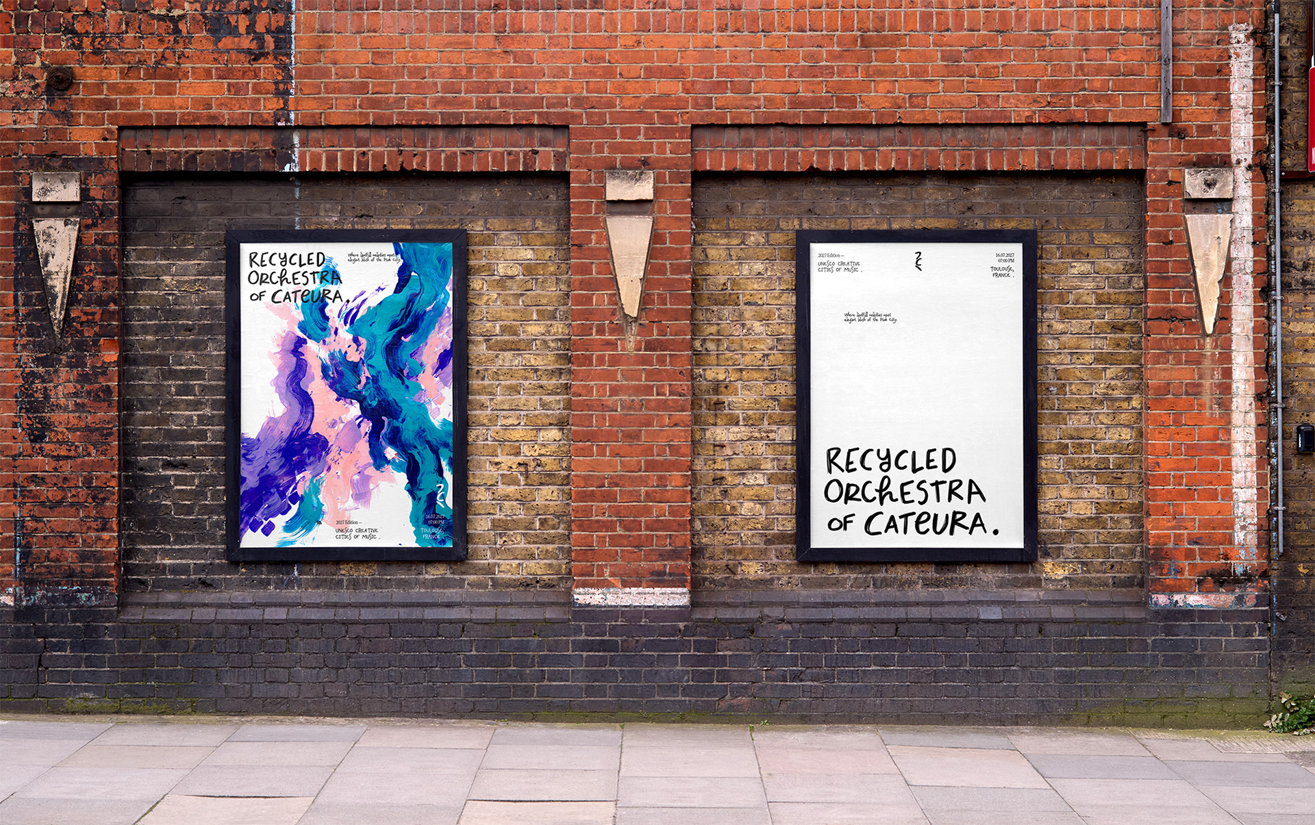
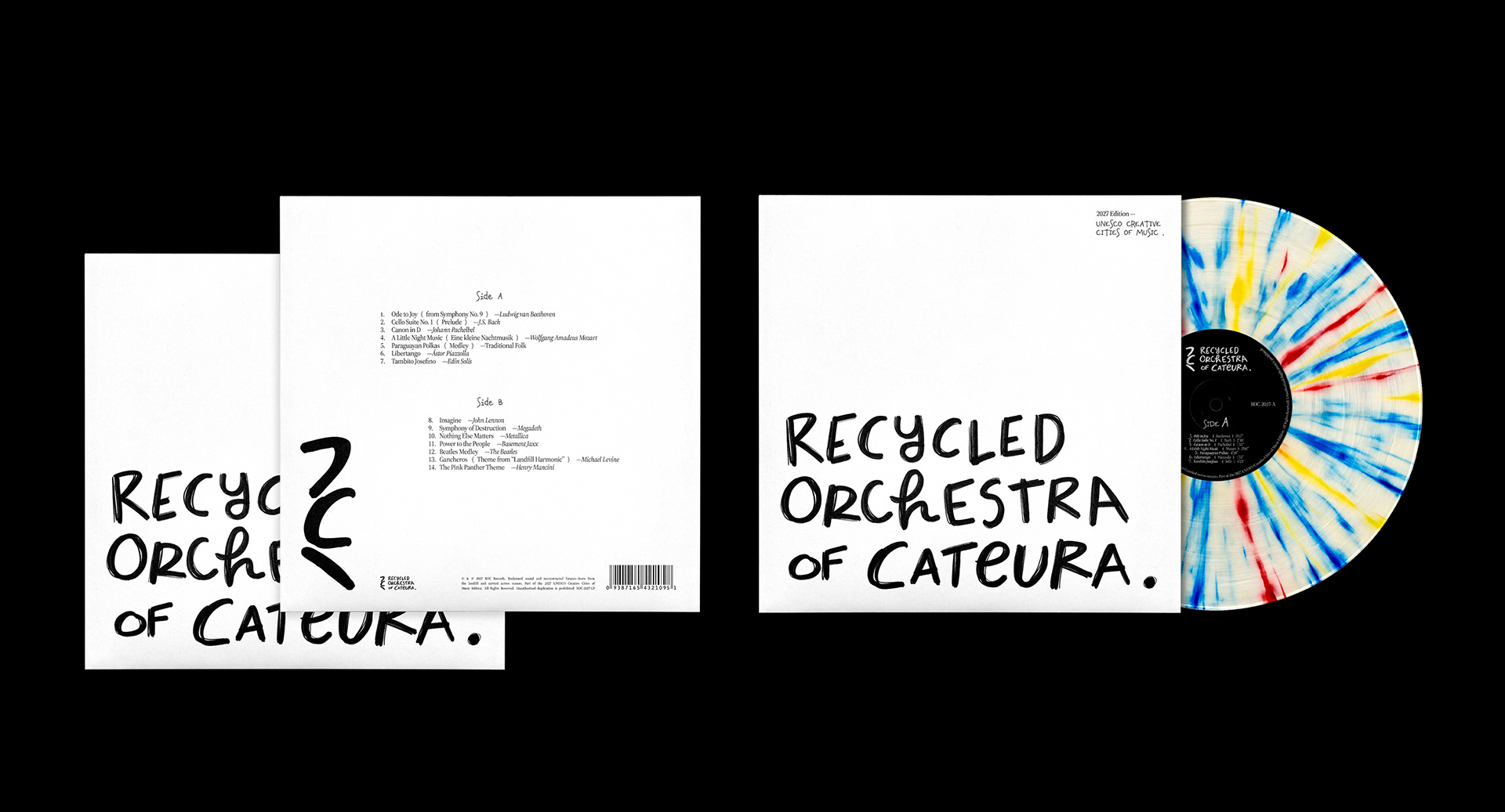
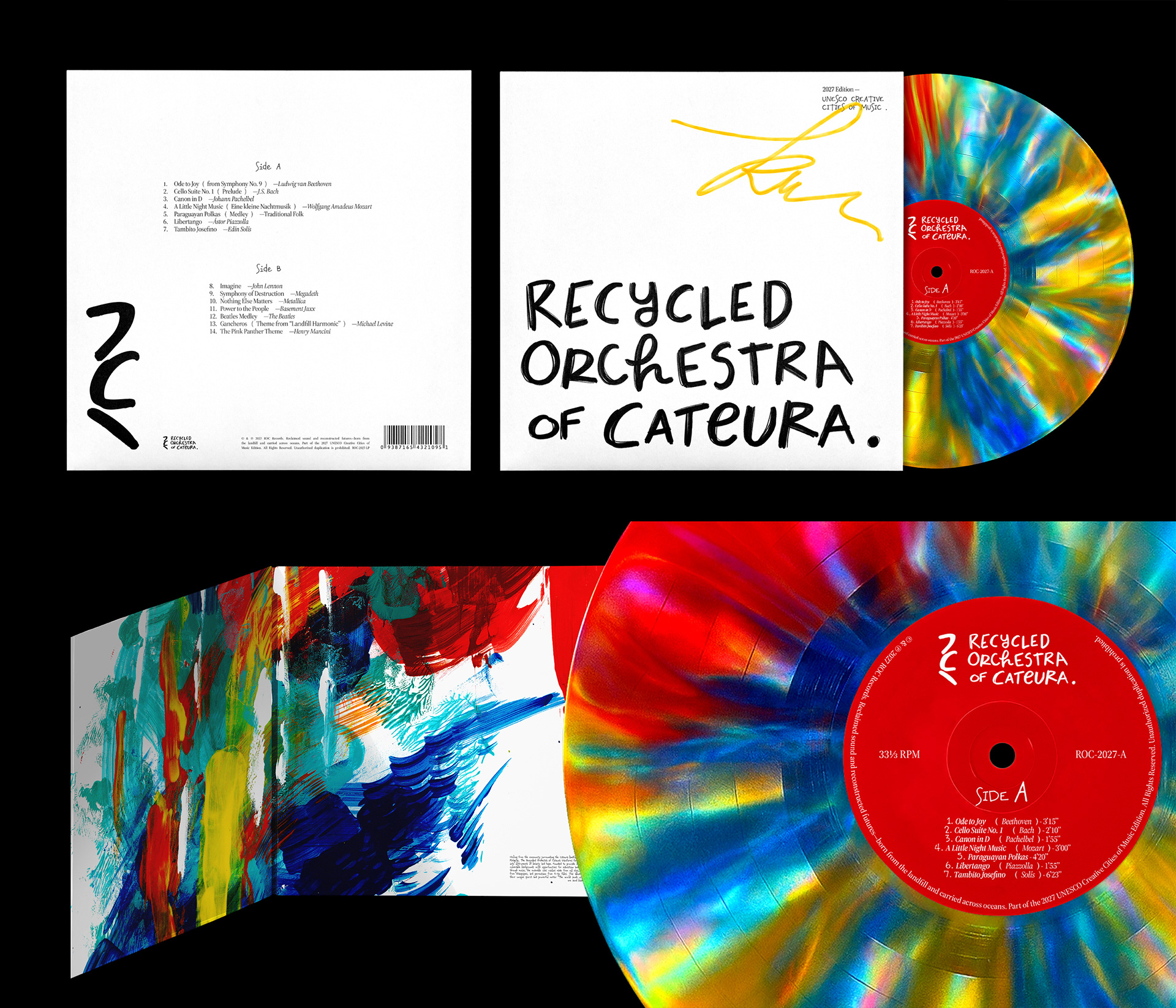
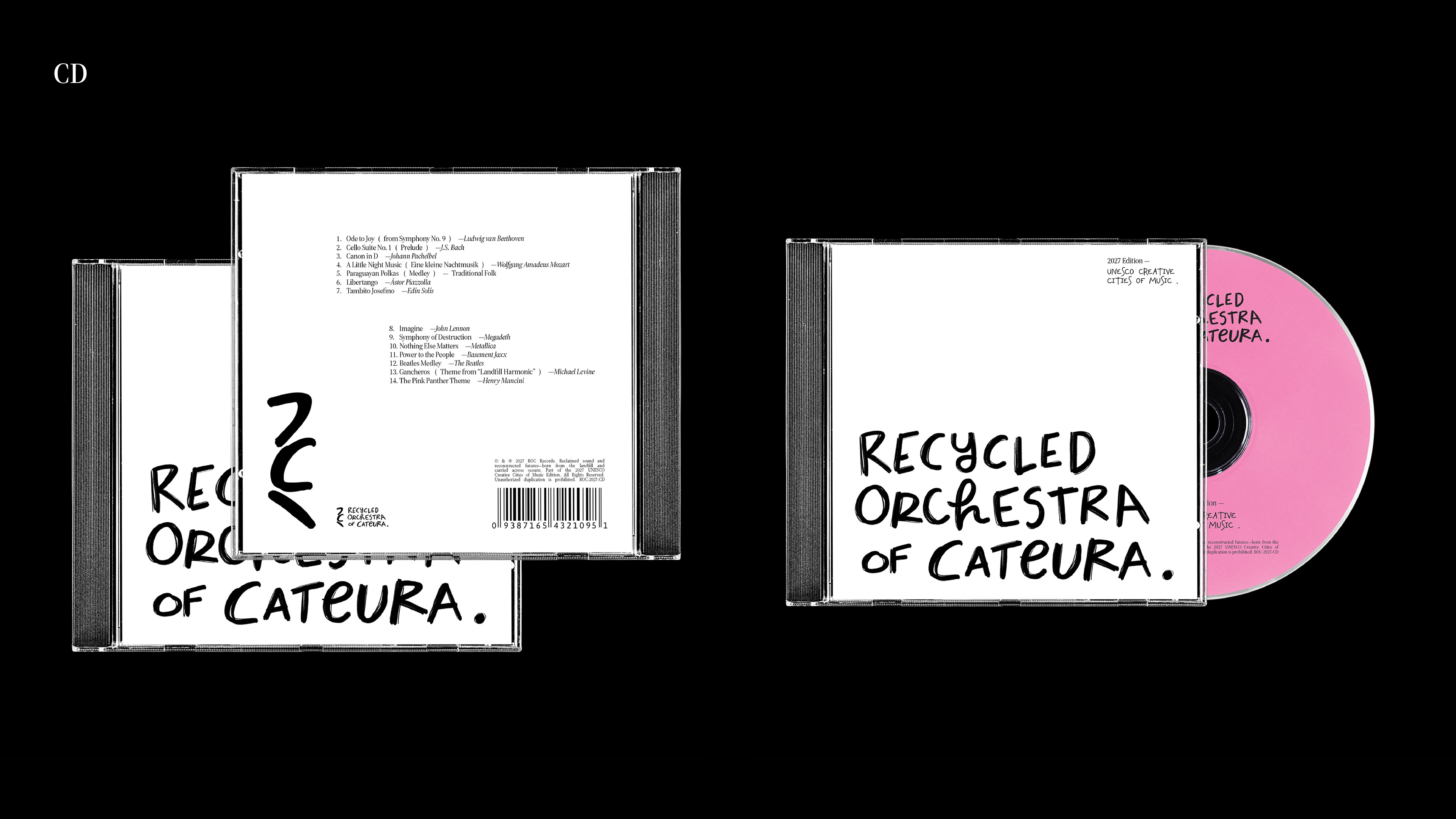
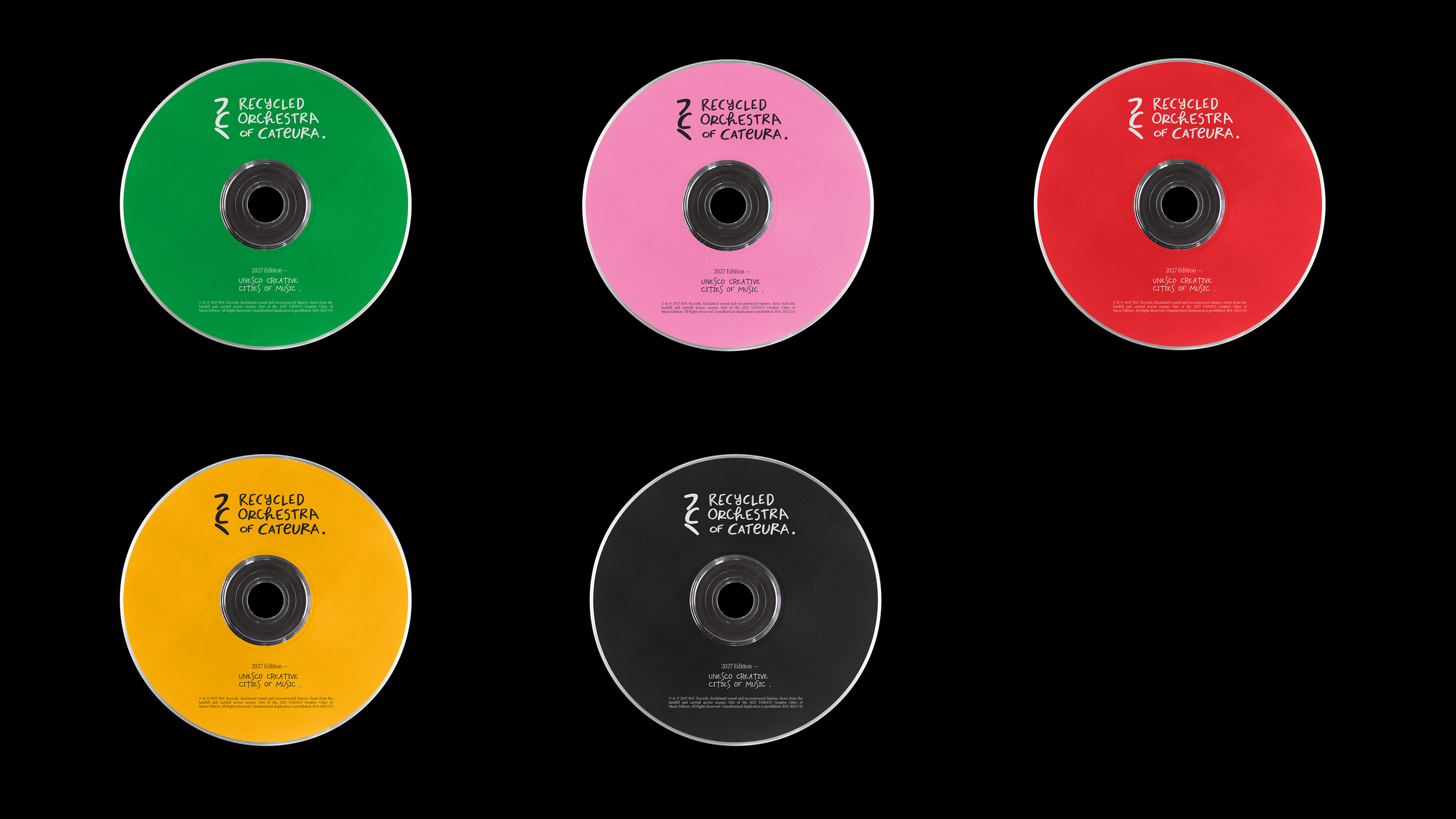
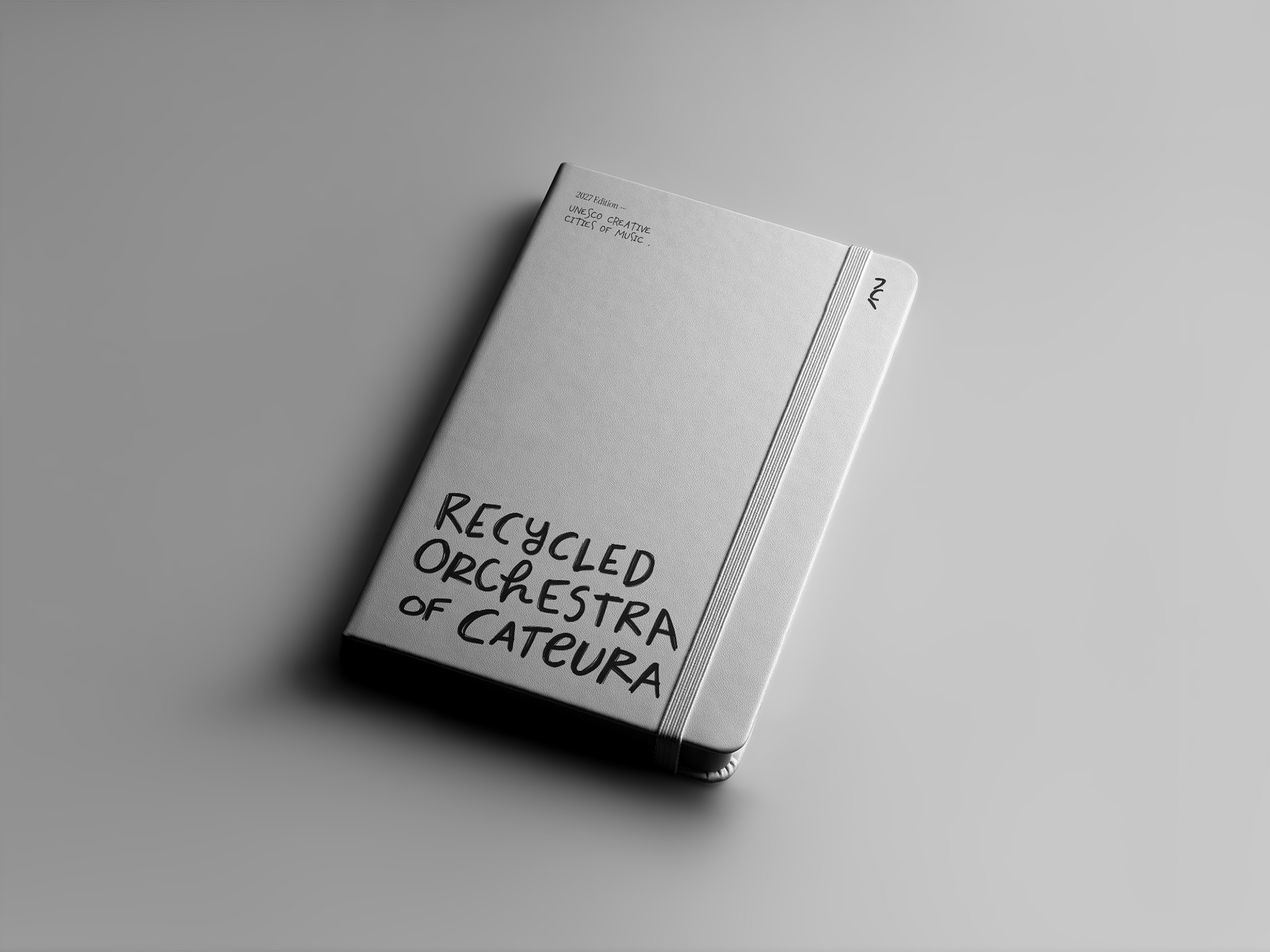
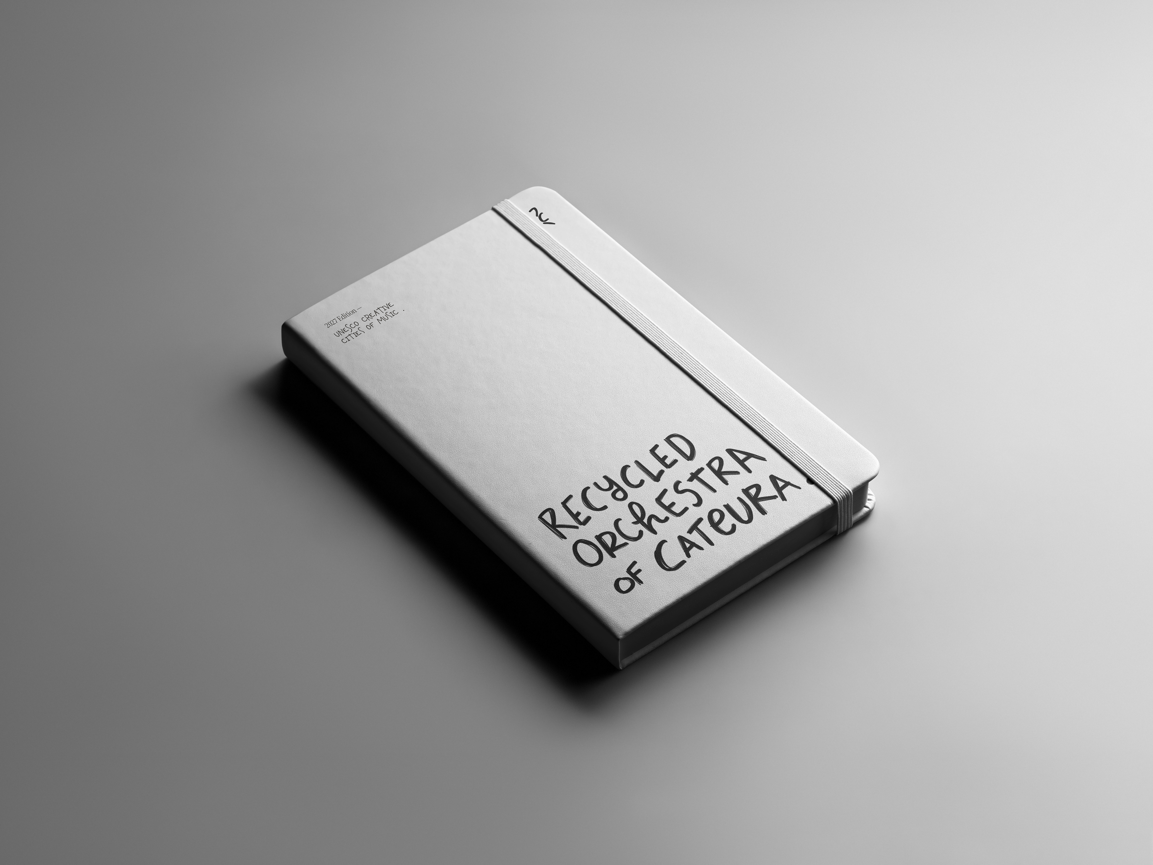
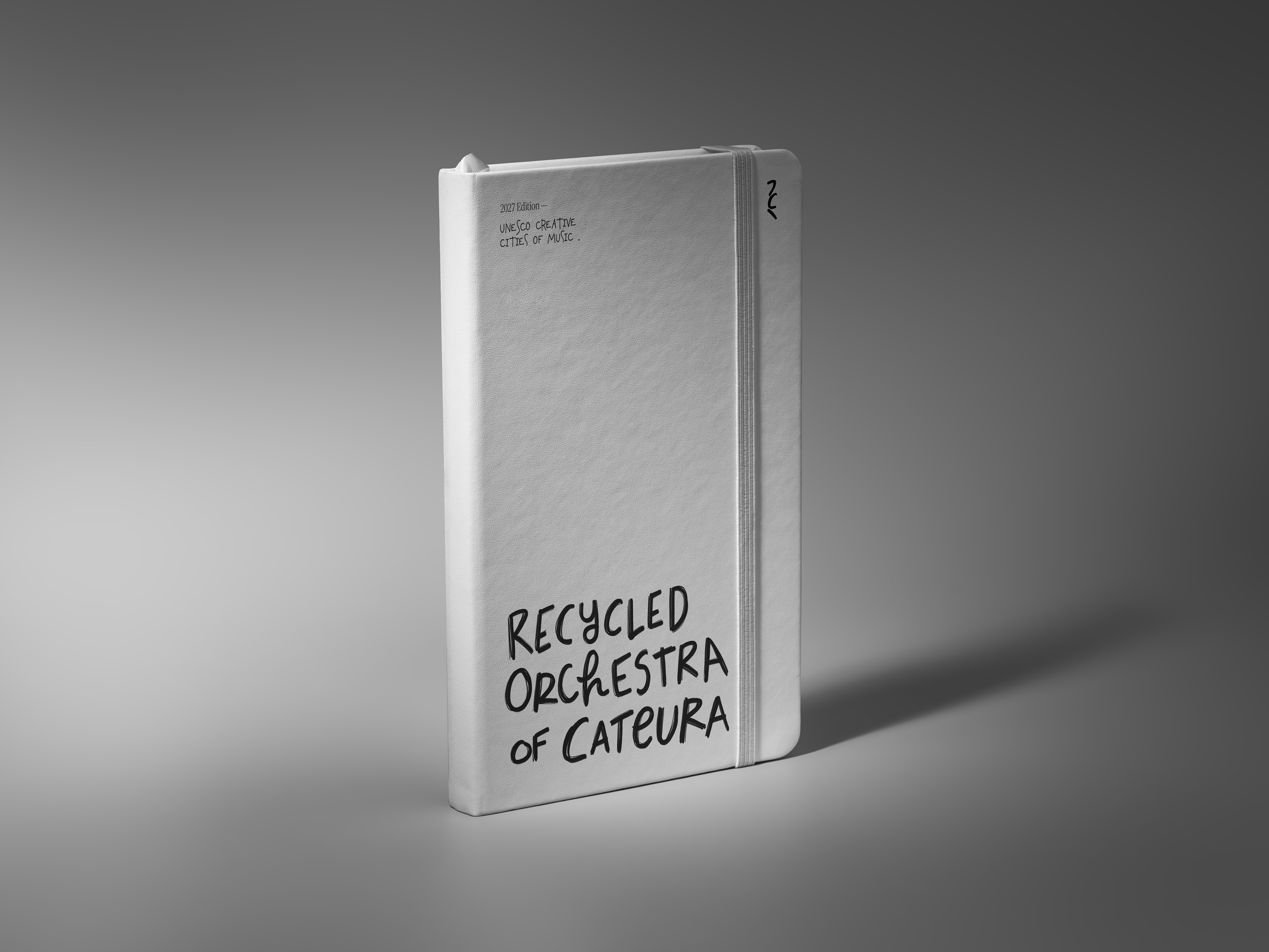
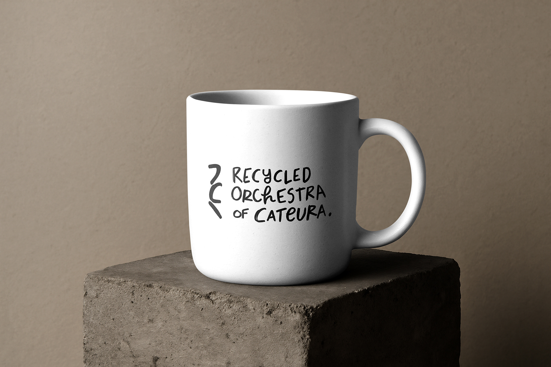
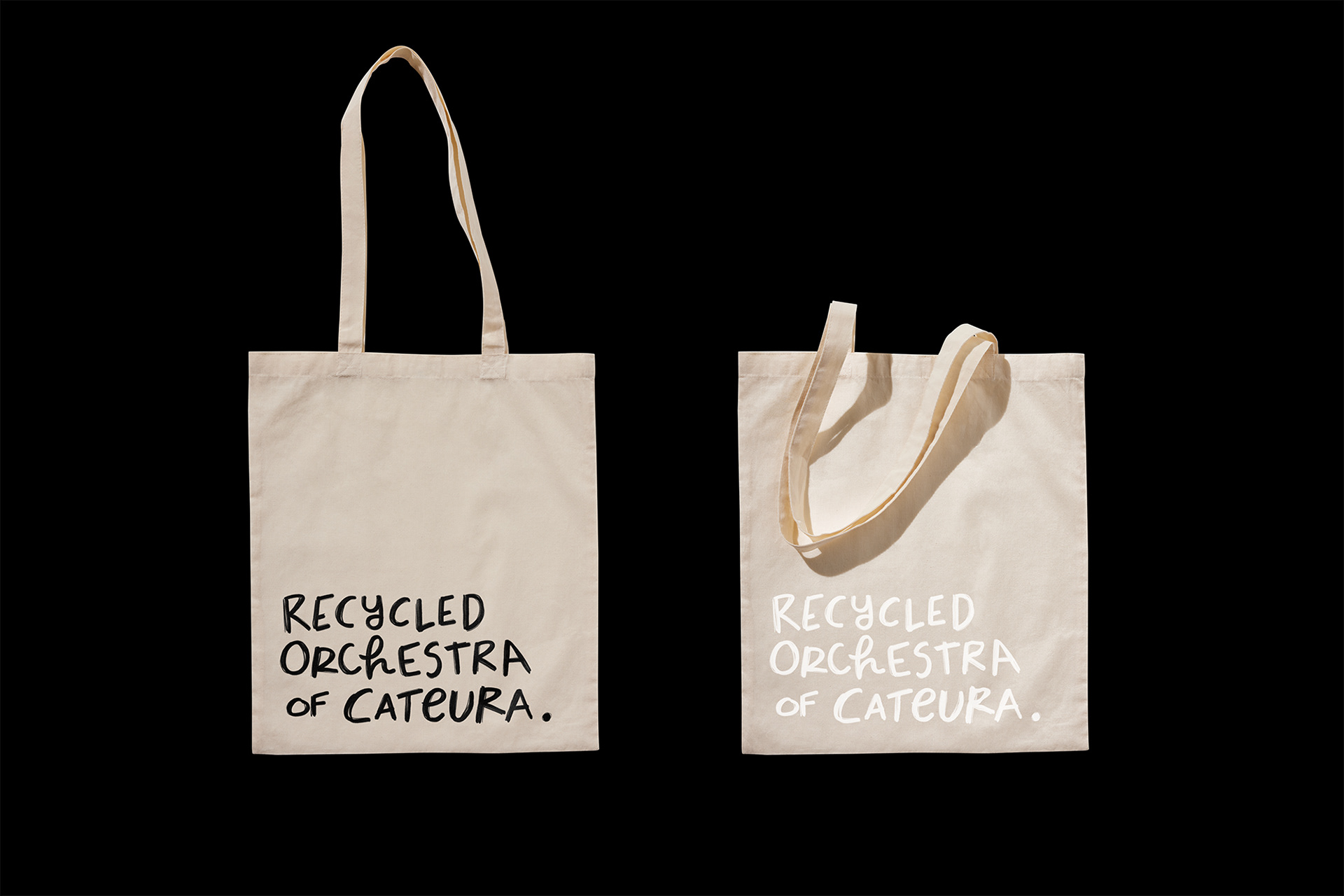
This logotype is created from the very core essence of the Recycled Orchestra of Cateura. Playing an instrument, or joining an orchestra, is often viewed as an elite pursuit — a luxury hobby where instruments can cost a fortune. Yet this orchestra breaks that convention entirely. They return to the true purpose of music: to connect people at a soul level, beyond wealth, privilege, and materials. By transforming leftovers and imperfections into instruments, they turn scarcity into creativity and community. This idea translates into the typographic logo. The handwritten letterforms embrace perfect imperfection and a childlike sincerity, representing the young musicians from a landfill community whose future is rebuilt through music.
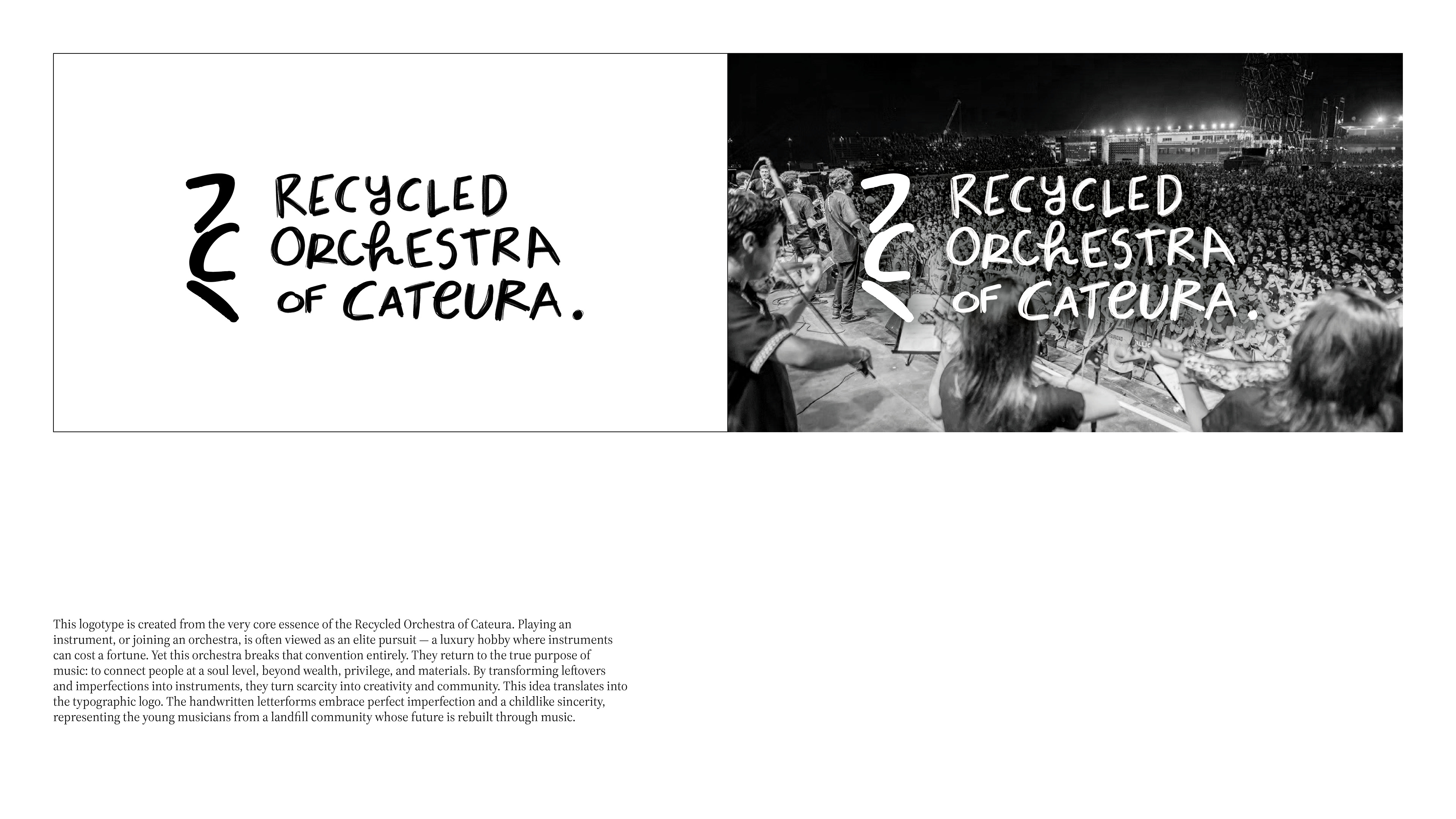
The icon echoes the same philosophy through visual deconstruction. Just as the instrument makers select discarded materials, trim them into workable parts, and assemble them into something functional and beautiful, I mirrored that process typographically. Using the “R” from Recycled and the “C” from Cateura, I disassembled and reassembled their shapes according to visual hierarchy. The result subtly recalls the quarter rest, a musical symbol for pause, suggesting that what the world overlooks as “silence” or “waste” can become the beginning of something extraordinary.
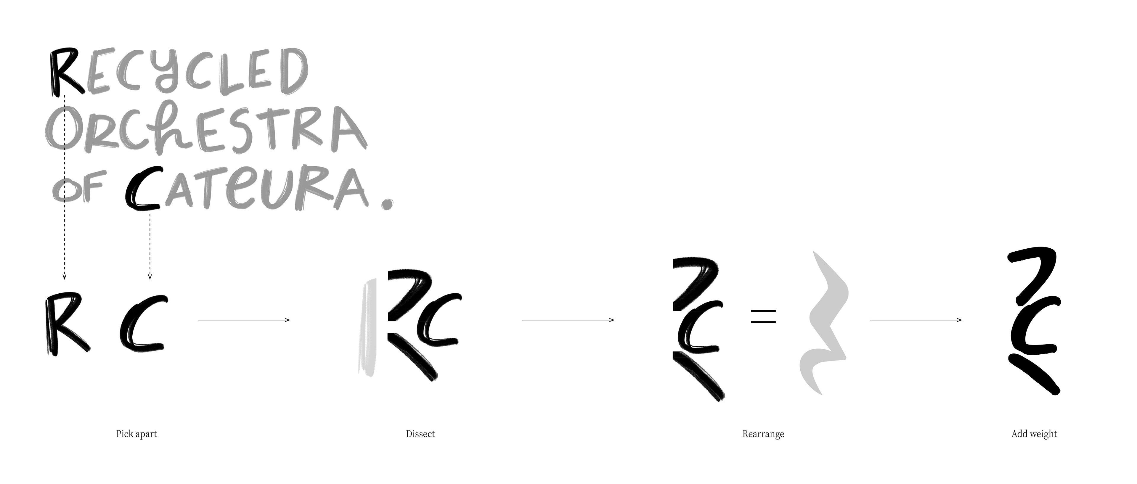
A quarter rest is a moment of silence, a space where music pauses without ending. It does not stop the song, it simply makes room for what comes next. The Recycled Orchestra of Cateura embodies that same idea. Born from a community often overlooked, they take what the world considers “silent” or “discarded” and turn it into sound. Like a rest inside a symphony, their story shows that silence is not emptiness, but possibility. From a beat of stillness, music grows. From landfill waste,instruments sing.


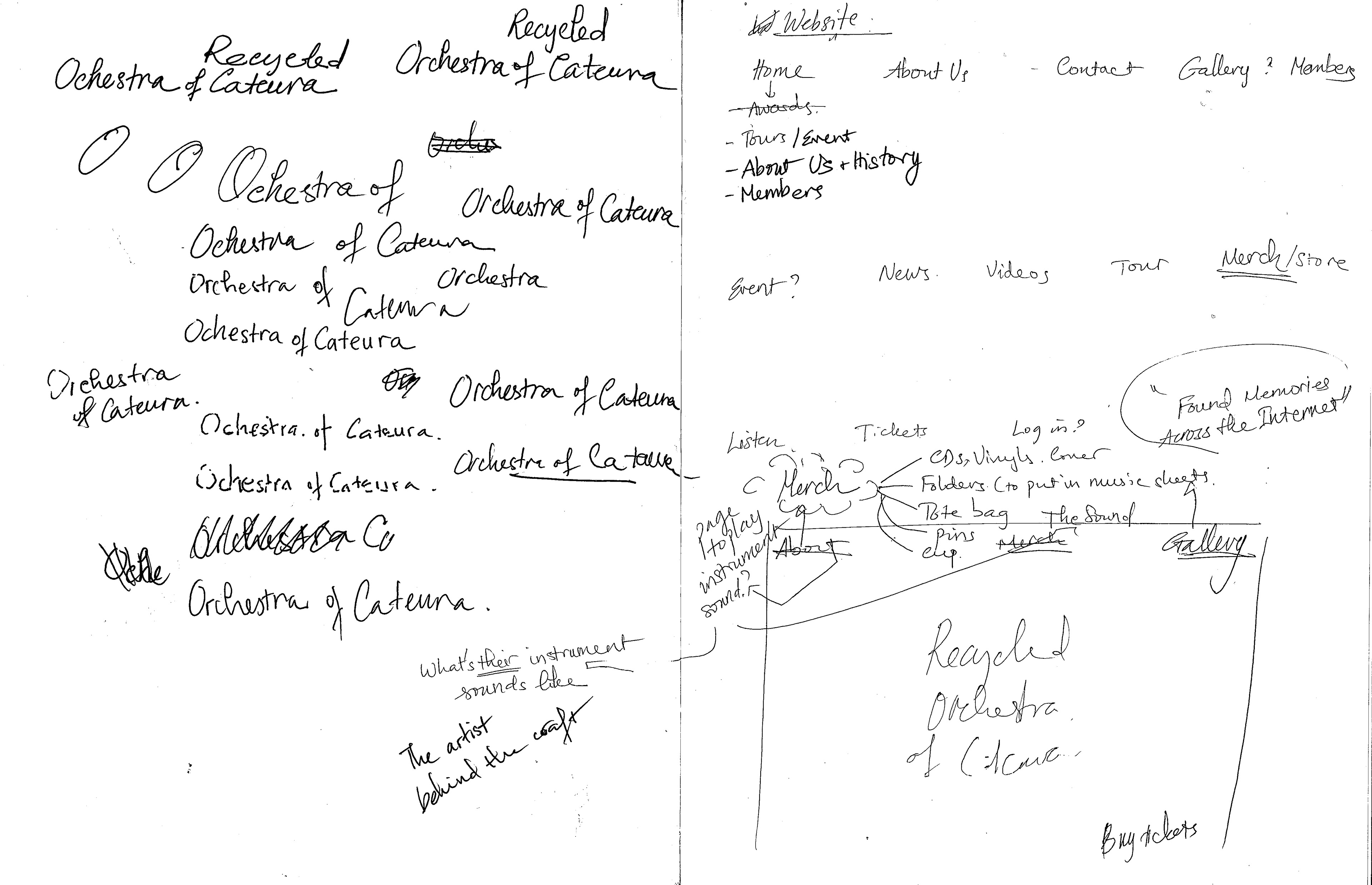
Sketchbook Diaries
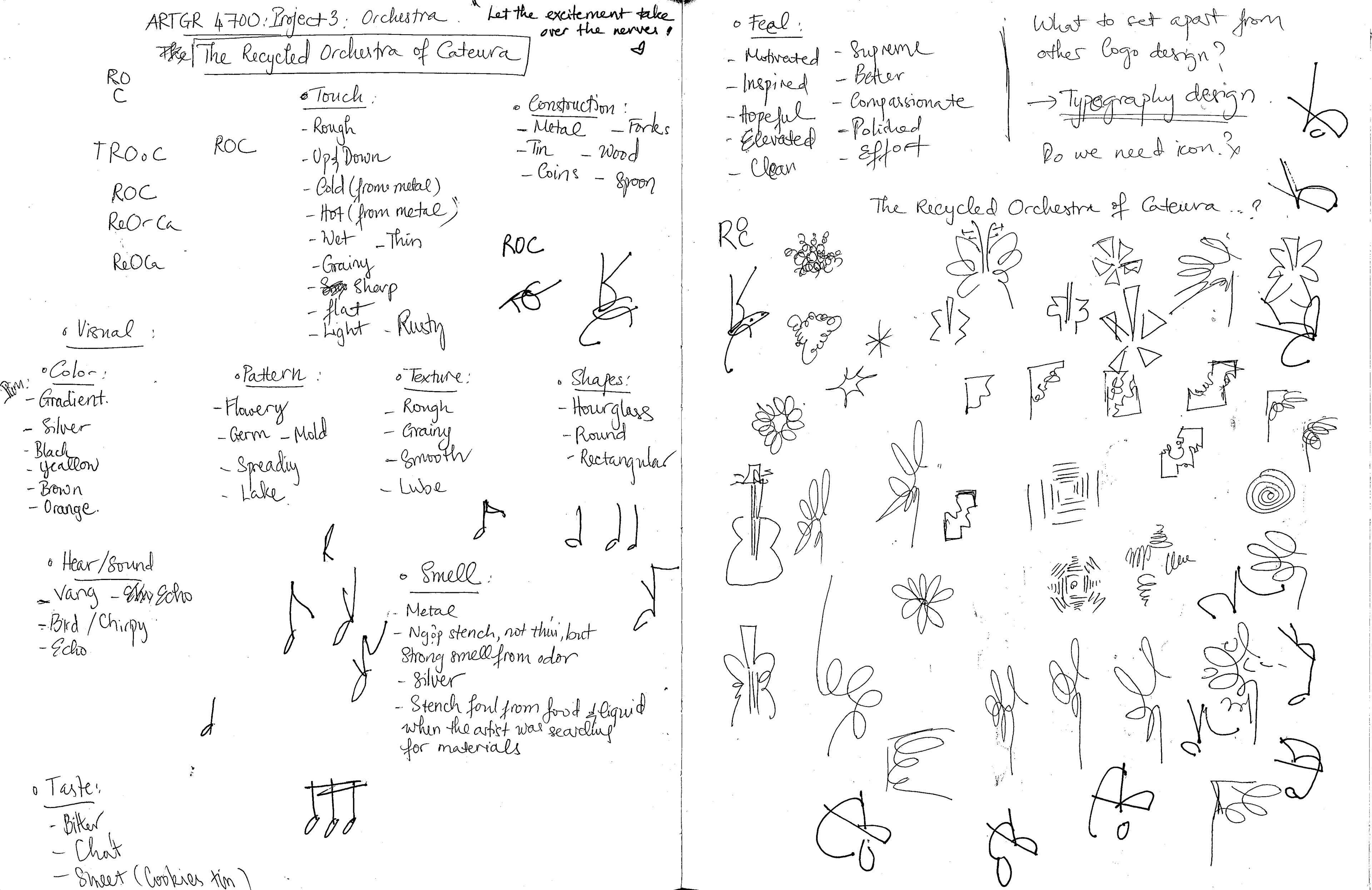
Stage 1: Sensory-Based Ideation
Initiate ideation through the five senses, including sight (color, pattern, texture, shape), touch (materials and construction), sound, scent, taste, and emotional feel, to establish the brand’s experiential foundation. Begin early experiments with logo icons.
Initiate ideation through the five senses, including sight (color, pattern, texture, shape), touch (materials and construction), sound, scent, taste, and emotional feel, to establish the brand’s experiential foundation. Begin early experiments with logo icons.
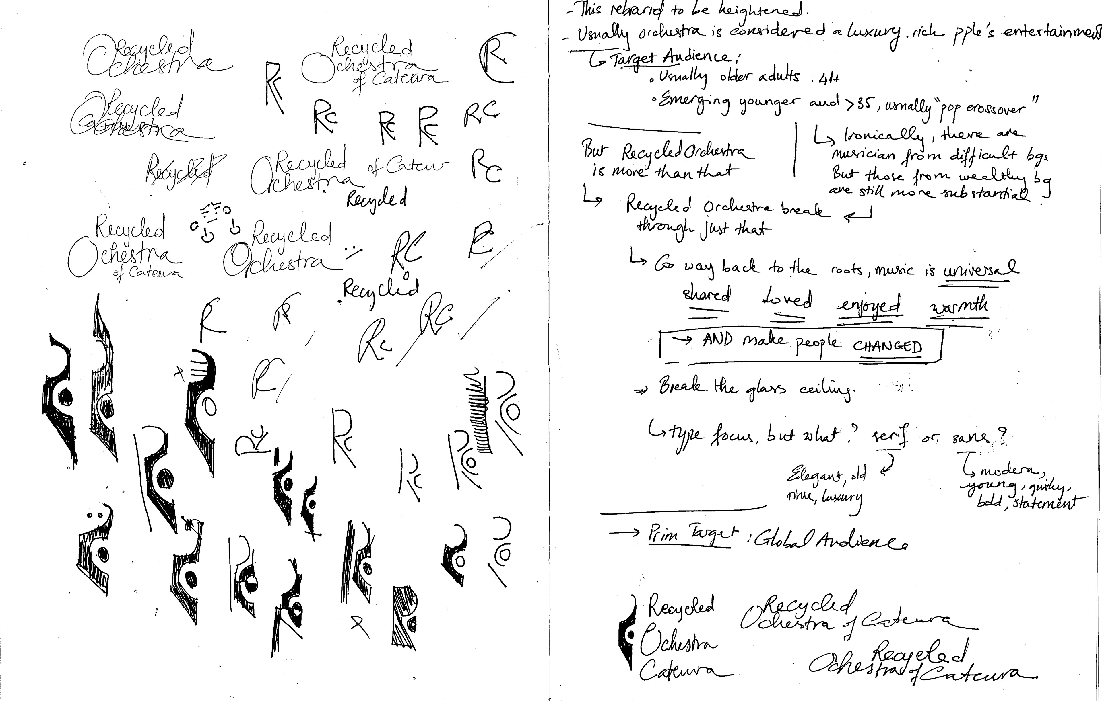
Stage 2: Brand Voice & Context Exploration
Define the brand’s voice by examining its target audience, purpose, cultural context, and future direction. Continue experimenting with logo icons and handwritten typography, supported by a SWOT analysis to assess positioning and opportunities.
Define the brand’s voice by examining its target audience, purpose, cultural context, and future direction. Continue experimenting with logo icons and handwritten typography, supported by a SWOT analysis to assess positioning and opportunities.
Stage 3: Logotype Development
Refine and expand logotype explorations, testing form, rhythm, and legibility across applications.
Refine and expand logotype explorations, testing form, rhythm, and legibility across applications.
Stage 4: Brand Foundation Definition
Clarify and finalize the brand’s core values, vision, and guiding principles.Stage 5: Visual Texture & Emotional Exploration
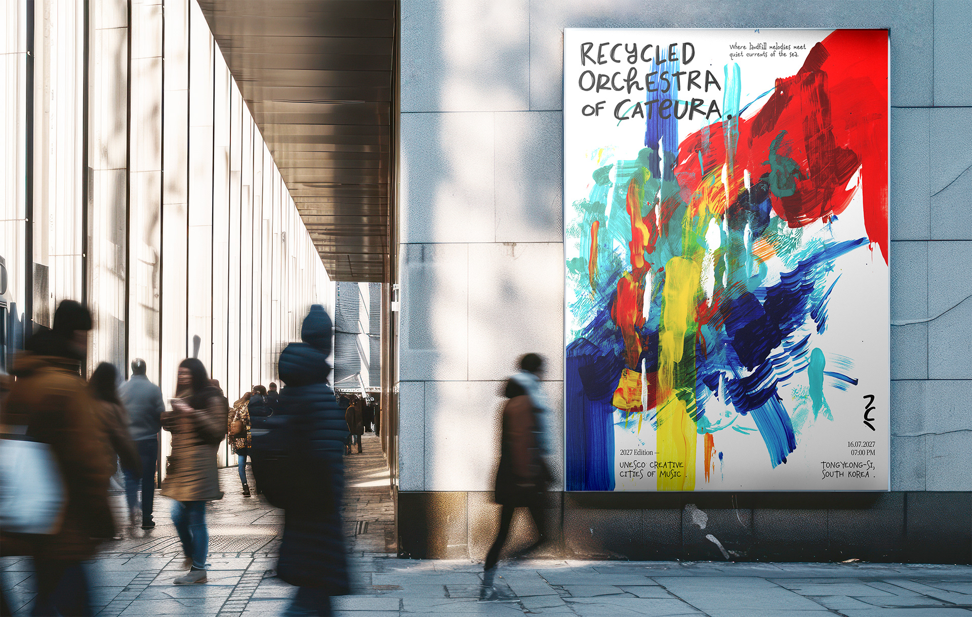
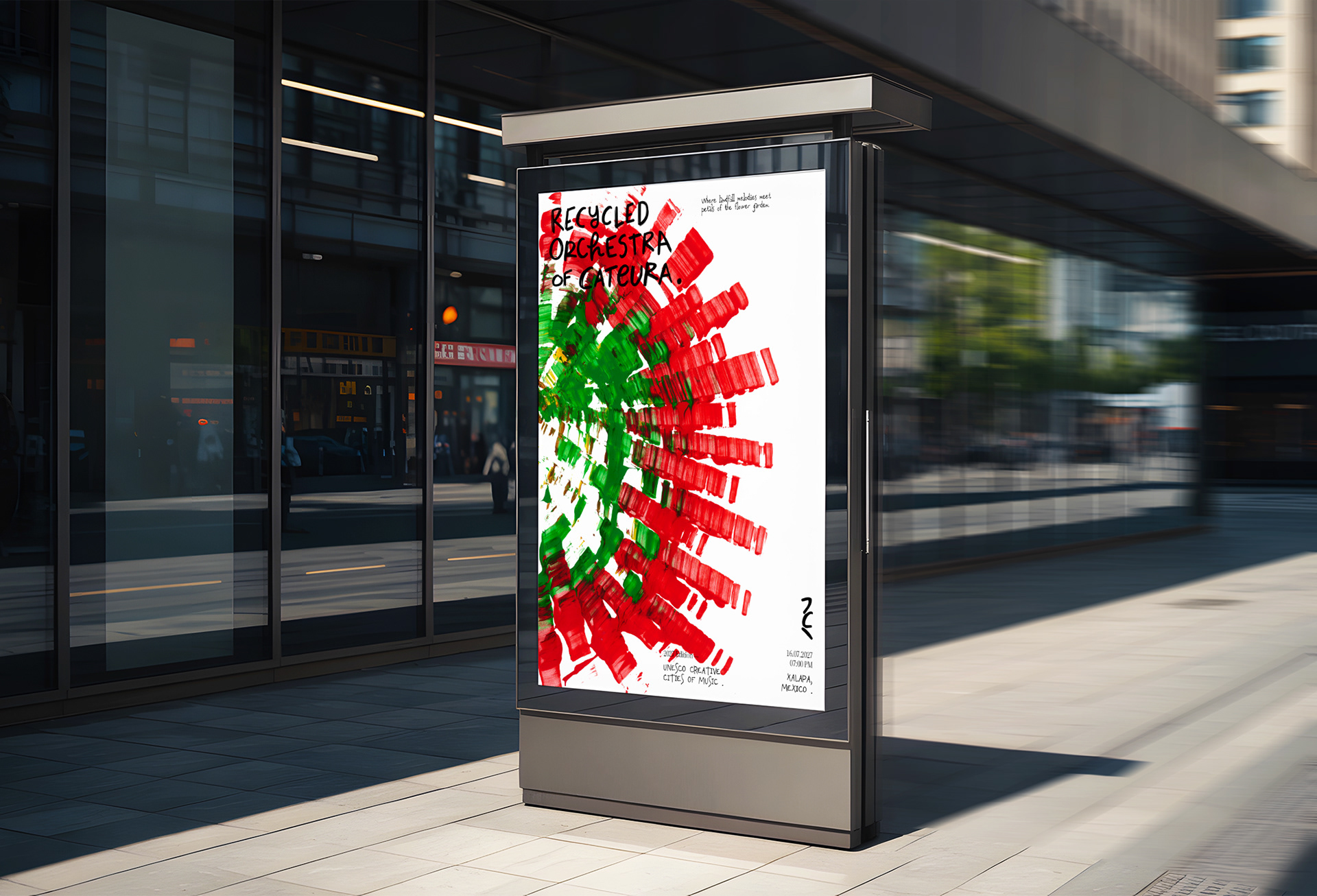
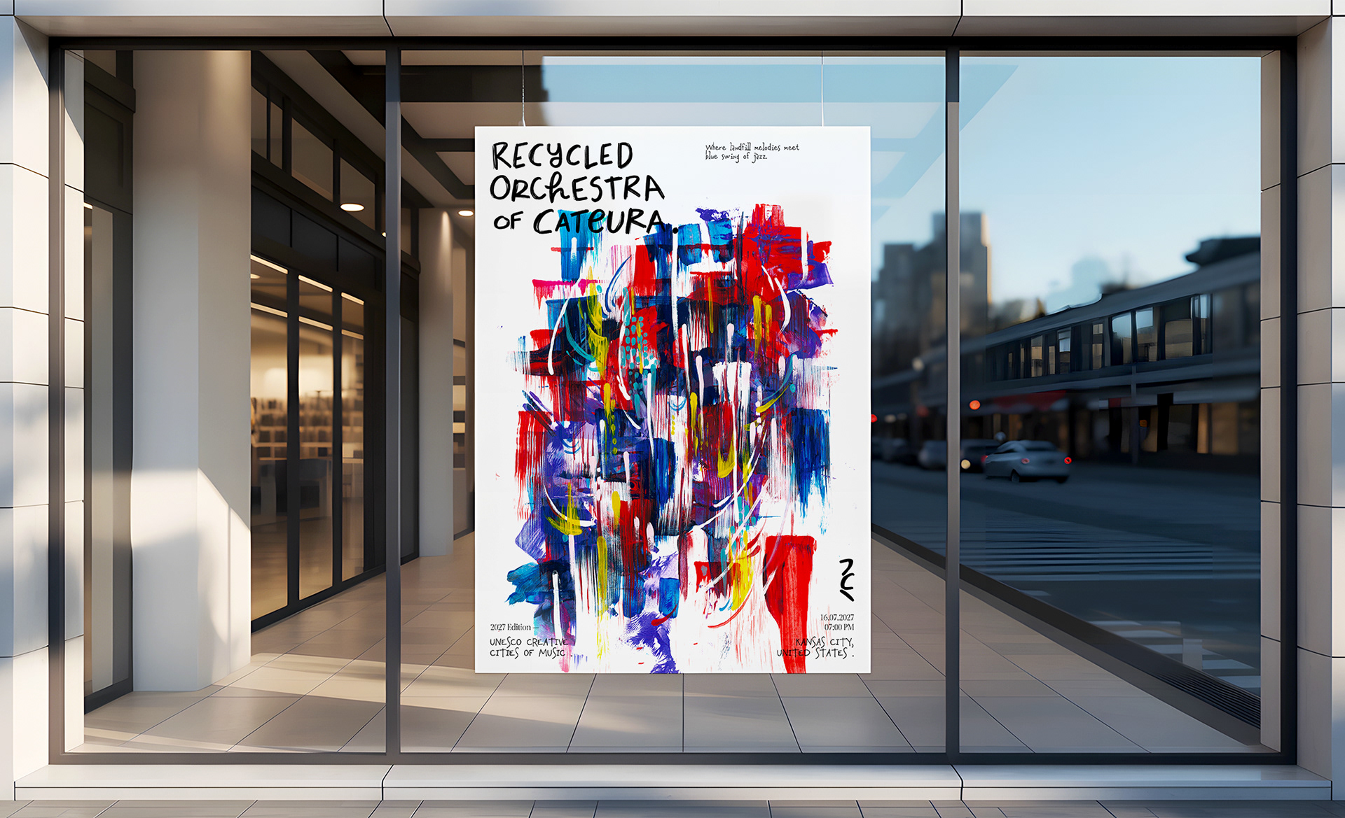
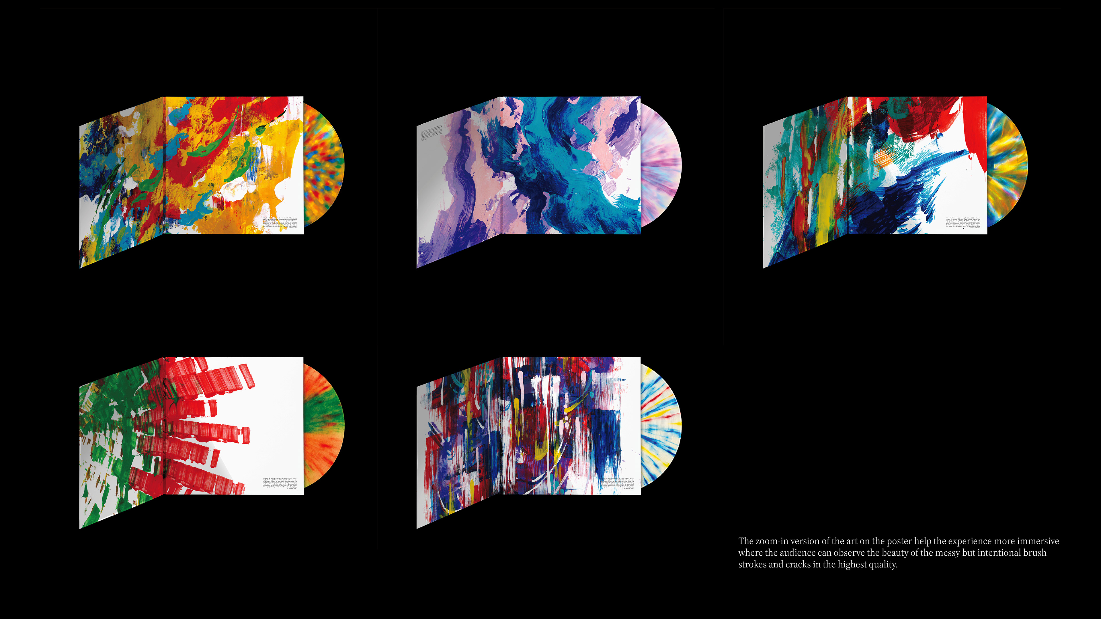
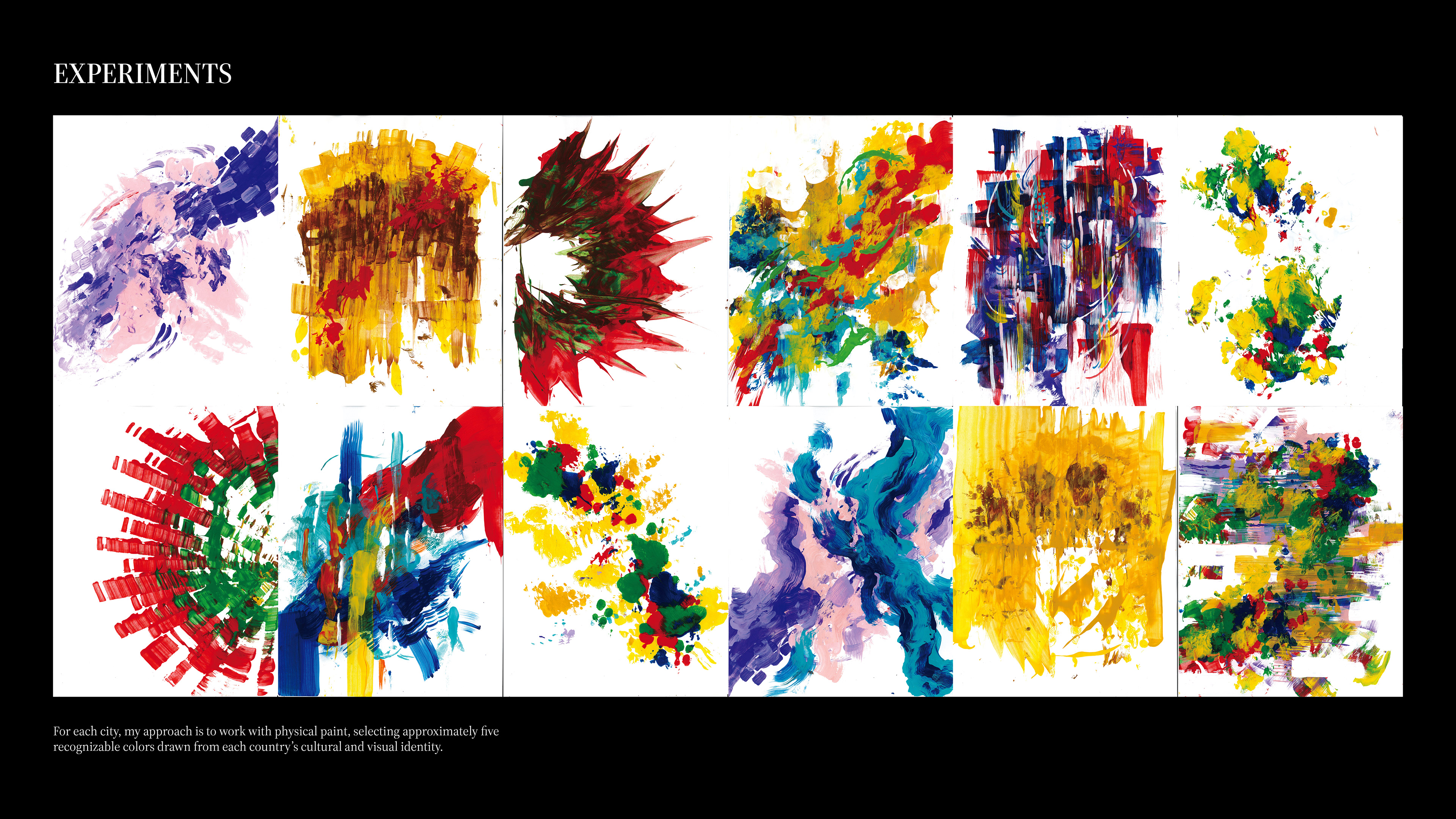
Experiment with abstract painting, textures, and expressive mark-making to capture emotional tone and atmosphere.
Clarify and finalize the brand’s core values, vision, and guiding principles.Stage 5: Visual Texture & Emotional Exploration
Experiment with abstract painting, textures, and expressive mark-making to capture emotional tone and atmosphere.
Stage 6: Identity Refinement & Typography System
Synthesize visual findings into a cohesive brand identity. Select and pair typefaces that complement the abstract visual language and overall aesthetic.
Synthesize visual findings into a cohesive brand identity. Select and pair typefaces that complement the abstract visual language and overall aesthetic.
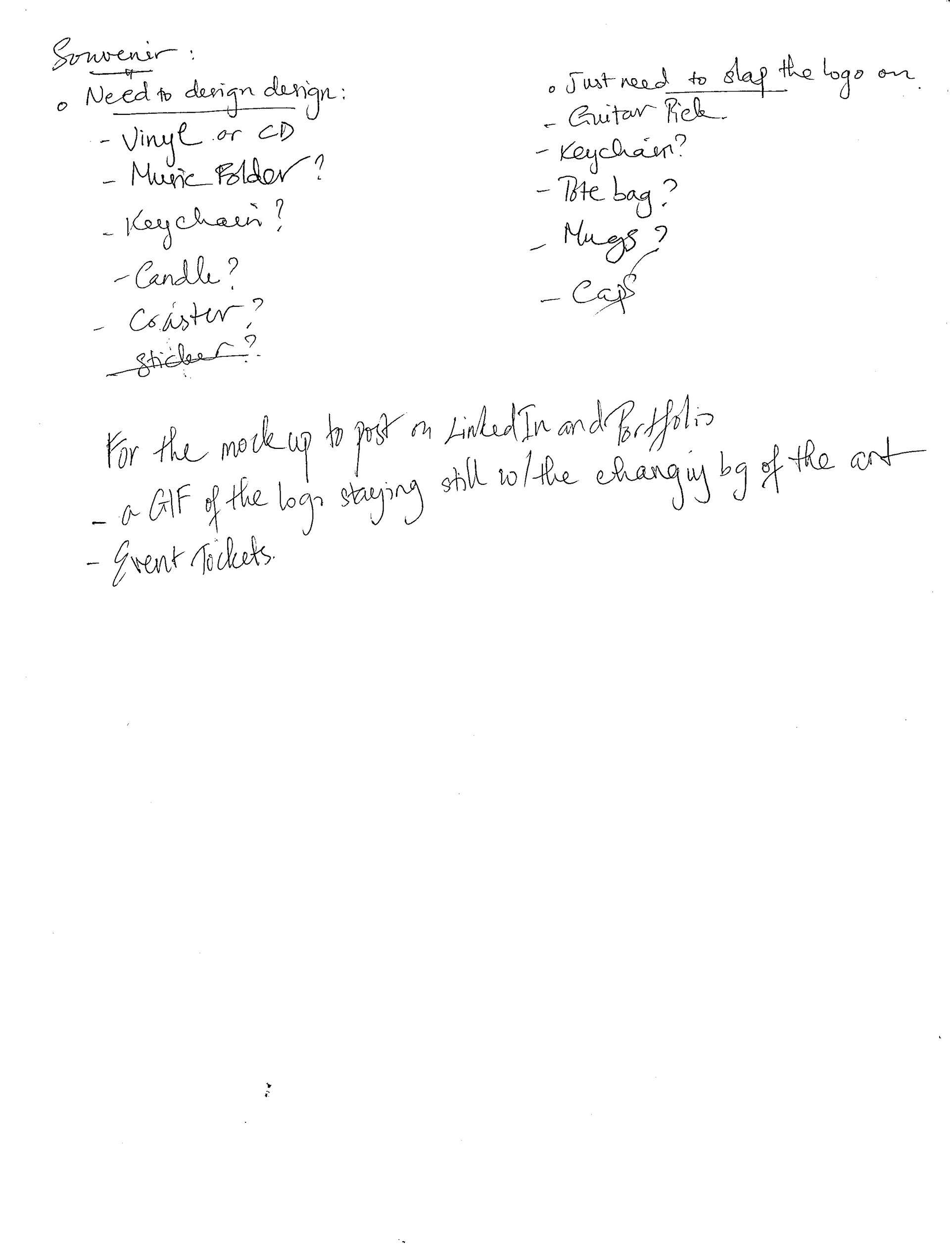
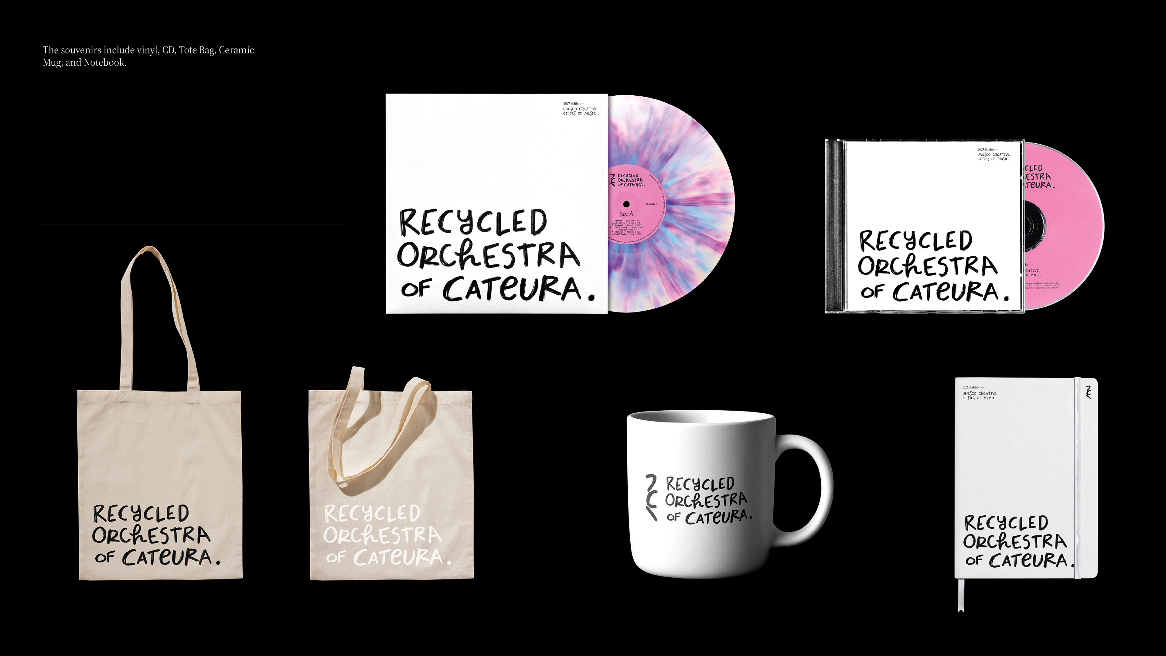
Stage 7: Souvenir & Extension Design
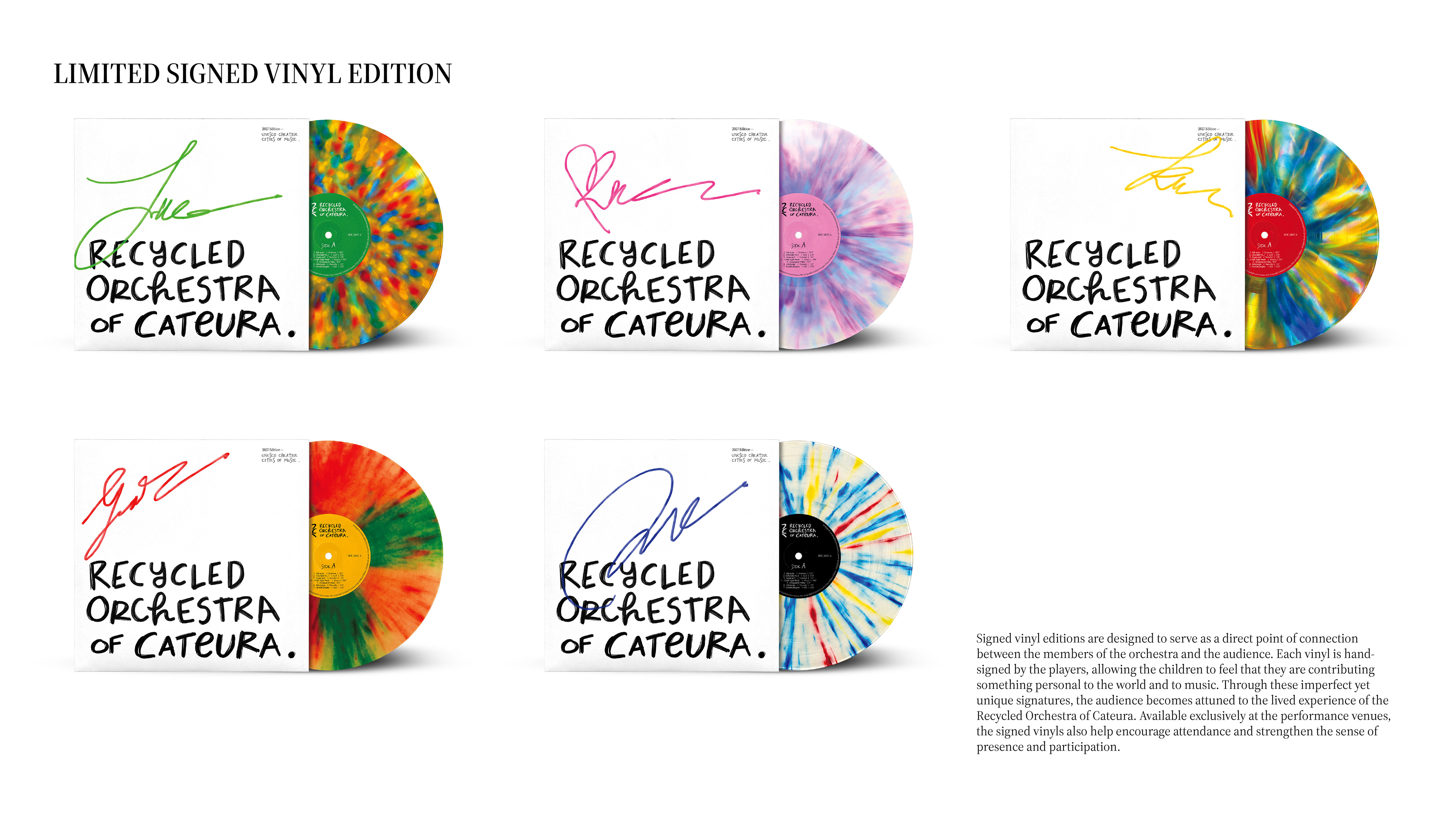
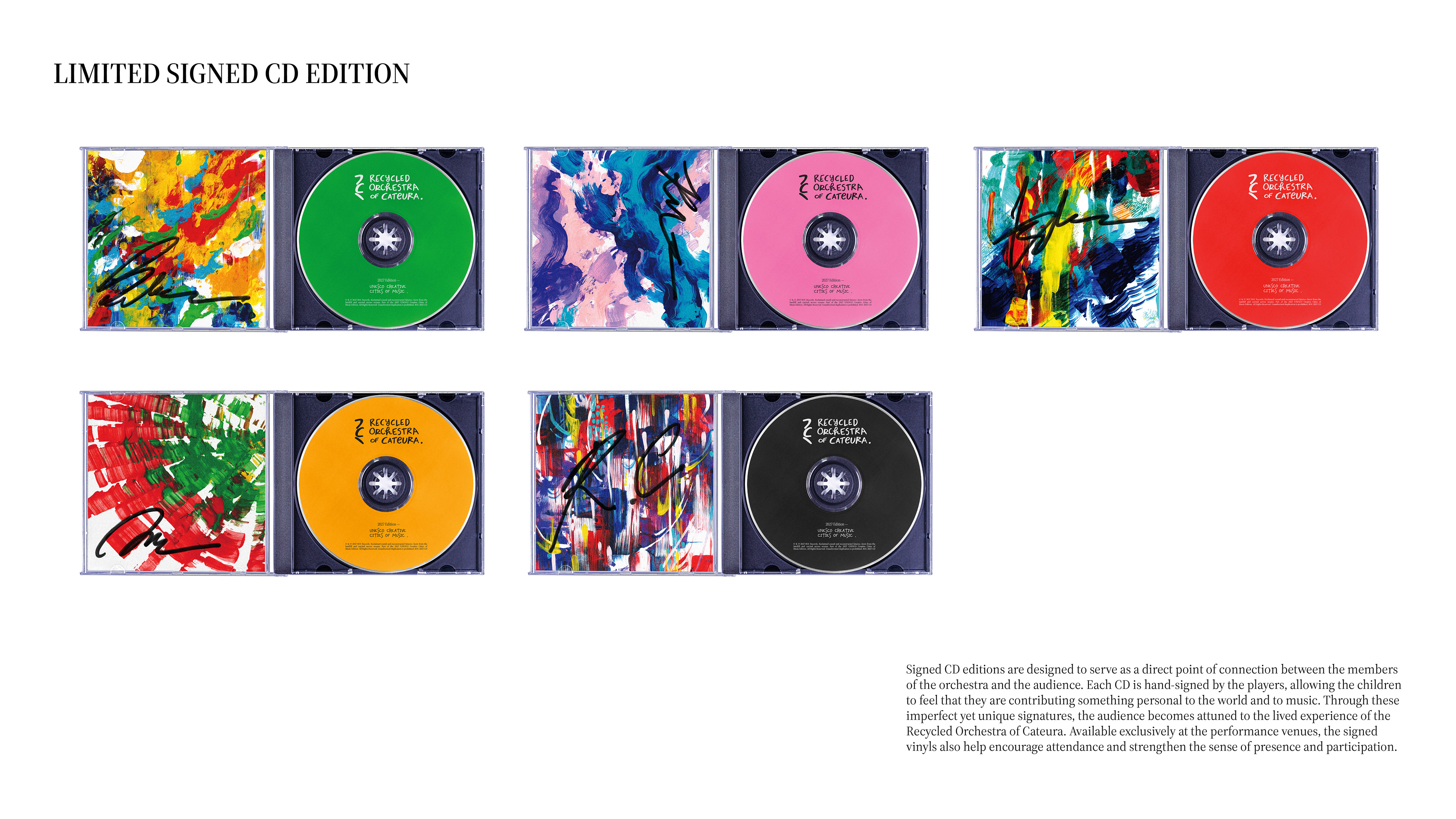
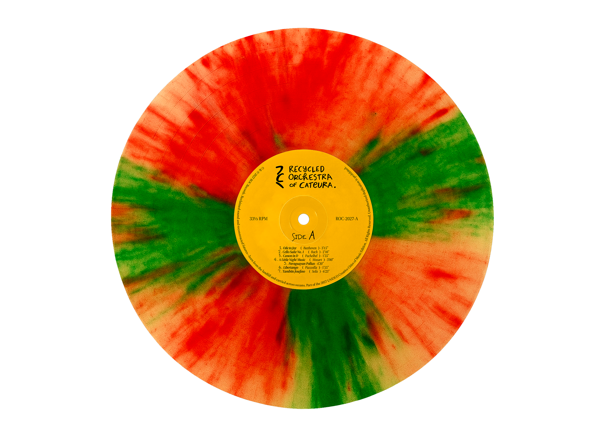
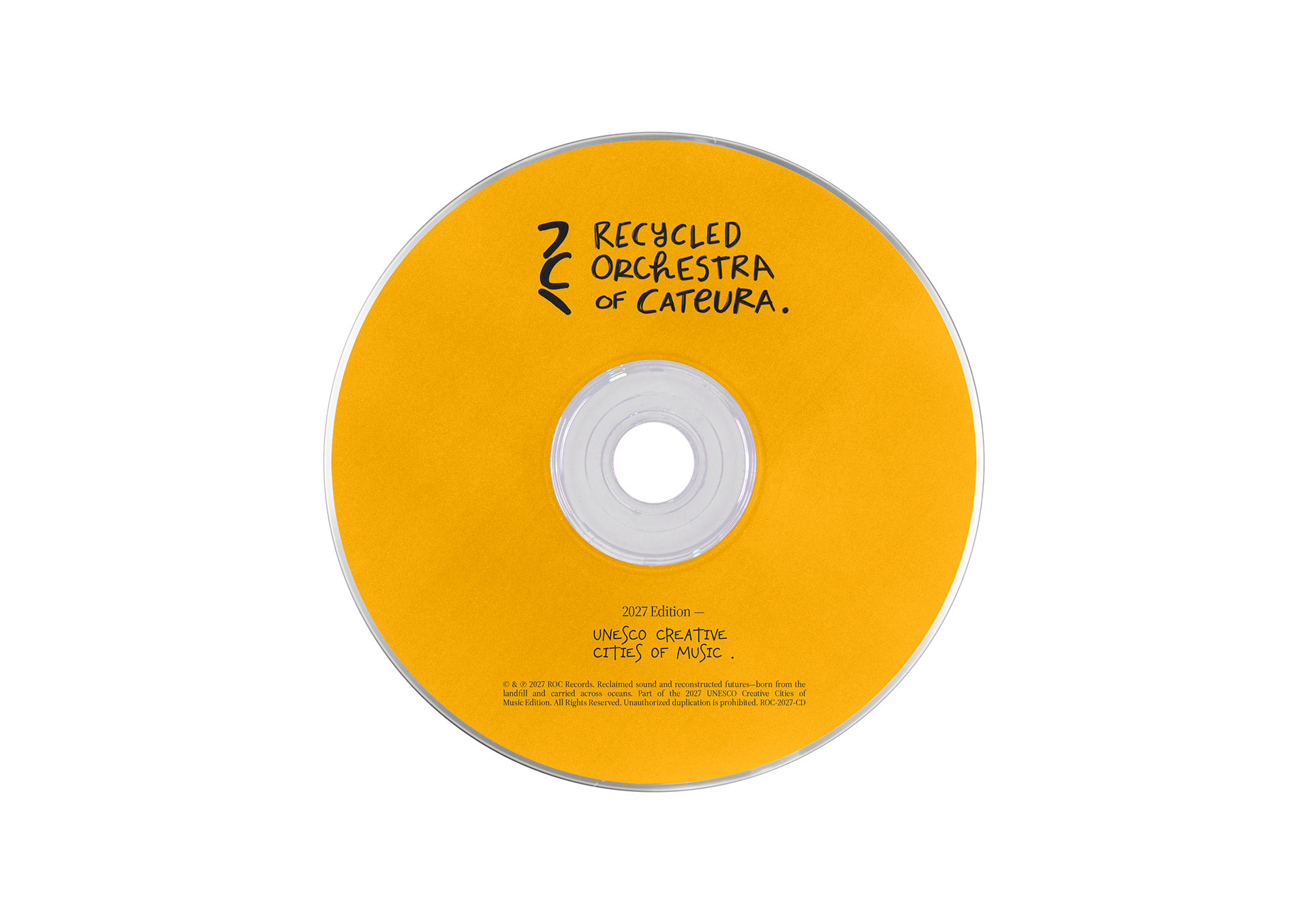
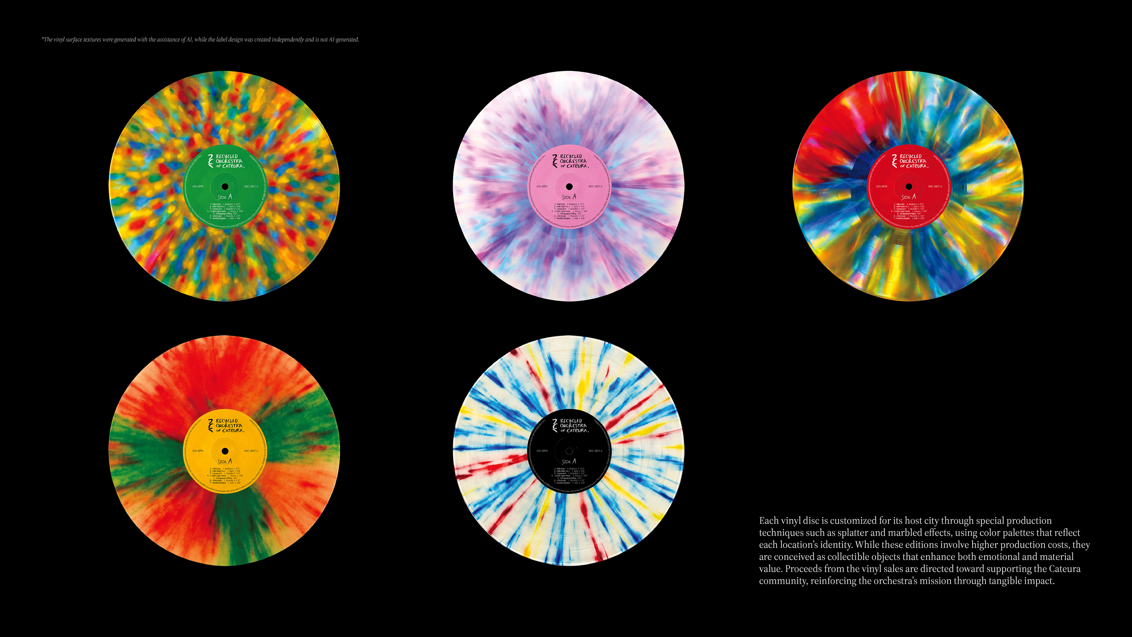
Design branded souvenirs or extensions that embody the identity and translate the brand experience into tangible form.
Design branded souvenirs or extensions that embody the identity and translate the brand experience into tangible form.